protonet design hacks
v1.2 –
protonet is a private cloud server. A few local browser-based design hacks can boost usability and delight in using the system.
protonet group navigation
The group navigation tabs [Home] [Topics] [Todos] [Events] [Files] and [Notes] are visually quite similar to each other. I wonder if it is possible to improve the usability with a few hacks.
A light gray background makes the buttons easier to recognize as control elements. Furthermore, icons make them more distinctive and easier to distinguish from each other. Size is also an issue. Hence larger buttons are faster to hit and improve usability.
Voilà – move the slider to see the change:
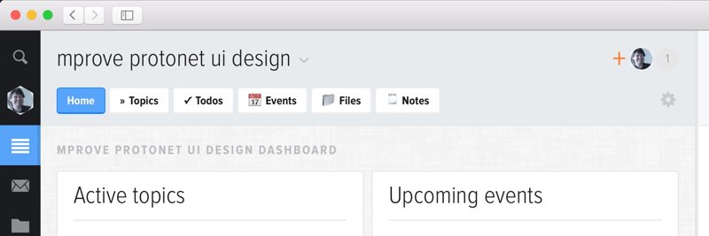
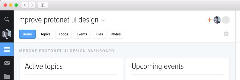
The good news is, all this can be done with CSS. The icons are unicode characters that render as icons. Here is the CSS code that can be applied by various means to your local internet browser.
The header background is discussed below.
protonet groups overview
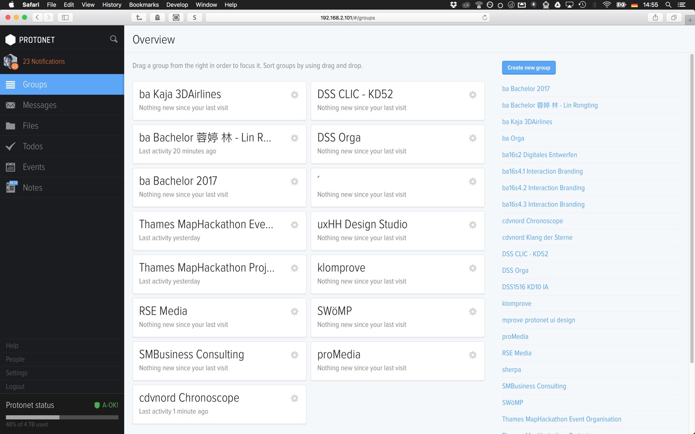
The page has two main purposes. Providing access to all the groups and showing update indicators for modified content somewhere in any group. Over all, with plenty of groups, there is so much going on that it becomes difficult to recognize the important facts.
Just tell me at a glace which groups show activity:
Take a look at the before/after screenshots.
The following elements have been touched to improve the usability of the page:
- Don't tell the user that nothing is new since the last visit.
- Color mark and flag for groups with updates.
- Clustering of groups into column layout instead of matrix layout. Does anyone remember the article The Magical number Seven, Plus or Minus Two? That's why chunks of groups of 6 groups is easier to digest and remember than plenty of groups in sequential order until the screen is full.
- Smaller group titels. They are still large enough for for legibility and headline style. But now there is more white space and long group titles are less often truncated.
- Less line heigt for the list of all groups on the right leaves more space for more groups.
- The help text has been moved to the bottom right. Once you know that you can move groups from the list to the main area and arrange them by drag'n'drop, the line of text is waste of space.
Again, all this can be done with a cascading style sheet:
A group named ´
Did you notice the group named ´ ? It is a simple hack to have a blank group in the overview area in order to preserve the layout. In addition, the acute accent comes alphabetically after the letters – therefore it even serves as a visual white space divider between the list of groups and the command Show all to reveal the archived groups.
protonet background color scheme
Just a few lines of CSS will adjust the header background (as shown above) and the the content area to a light pattern.
The header change is important as the head area now works as a bounding frame for the content. White does not do it.
The light gray pattern background for the content area (.master) is just taste. I leave it up to you to include it.
protonet lists
Topics, Todos, Files and Notes use lists to display topics, todos, folders, and notes. There is quite some visual clutter between the items that can be cleaned up with a few CSS statements.
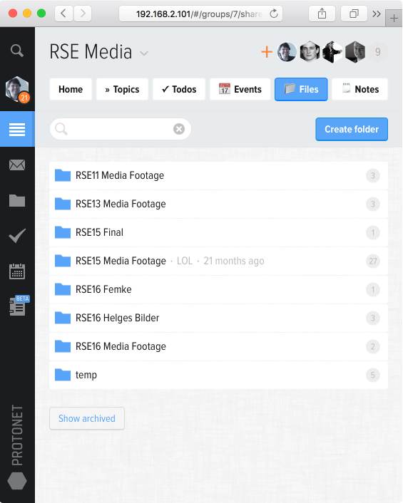
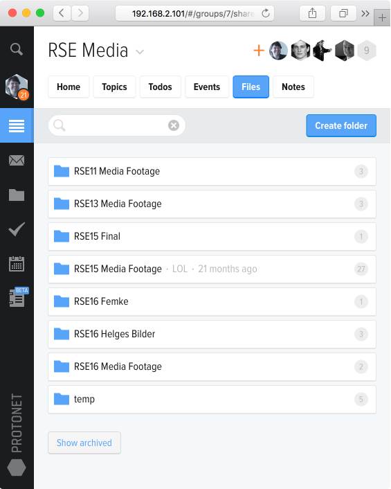
Oh, sorry, it is just one statement. But the effect is significant.
colorful calendar
Here comes a colorful calendar for protonet – colorful not as in rainbow – but colorful as in ambient and context-aware. It means that the past is painted in pale yellow, today is marked light blue, and the weekend is markes as such.
Take a look at the before/after screenshots.
The styles:
how to apply the design hack?
As a protonet admin you can simply customize the user interface of your protonet box (build 99). Go to Settings – Personalize and copy'n'paste the styles into the textfield at "Your own CSS". Re-login and you are done!
In case you are not an admin, you can apply the design hacks in your local browser for any protonet interface.
Firefox
- All cascading styles in one file, ready to be used with Stylish for Firefox: protonet.css
Chrome
- With Stylish for Chrome, you have to copy the the CSS statements into a new module and eliminate the "@-moz-document"-wrapper from protonet.css.
Safari
- Create a local .css file and copy the content of protonet.css into the new file and eliminate the "@-moz-document"-wrapper.
- Activate your custom styles at Safari>Settings>Advanced>Style sheet.
One more thing_
_from Jochen Czwalina /9/2020: Noch ein kleiner Hack – funktioniert auch auf der aktuellen stable-Version…
Feedback – please leave a message
brandmystic Love design hacks!
 hci.social/@mprove or
  norden.social/@chronohh
 mprove@acm.org
- More channels
