28 Top inspiring iPad Apps
Updated 3/14
So here we go, I am exploring the mobile touch world for quite some time. Not as an early-adopter – but more like someone looking for the unique characteristics of the new paradigm of interaction design. I’ve already presented my point of view at several occasions, e.g. at HyperKult XX on Back to Childhood – Infantilisation of UI Design. With this list, I simply want to share my most favorite iPad apps. The order is neither a verdict nor totally random. I hope you enjoy.
If you do not share your analysis then it is not research, it is a waste of time. – Dave Winer at reboot11 [cf. Bruce Sterling – minute 40]
davewiner /19 Dec 2012: @mprove -- nice quote! :-)
kaigradert /25 Feb 2014: Fantastic list of creative iPad apps…
frax
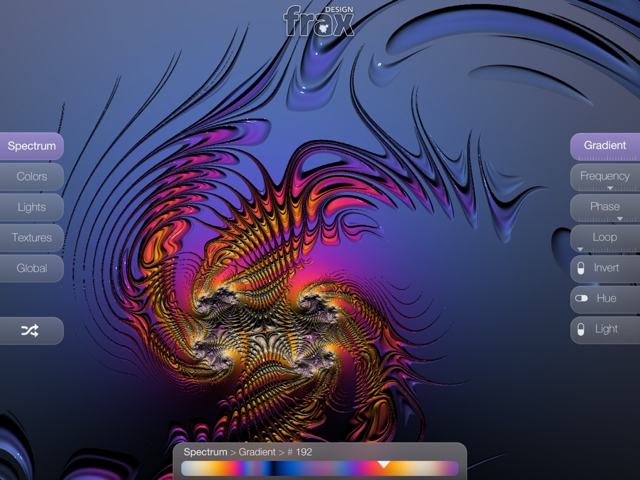
This alien is a fractal Julia set! You can smoothly zoom in in real time and explore endless mathmatical landscapes. Forget about entering complex coordinates and parameters and then waiting endlessly until the Mandelbrot or Julia set renders on your screen. Dive in and change colors, lights, and textures by simple touch gestures. Frax is neither a toy nor a game. Instead it is a looking glass into the structures of our universe. Frax was designed and developed by Ben Weiss, Kai Krause, and Tom Beddard.
frax HD for iPad | frax for iPhone | fract.al
Beethoven 9
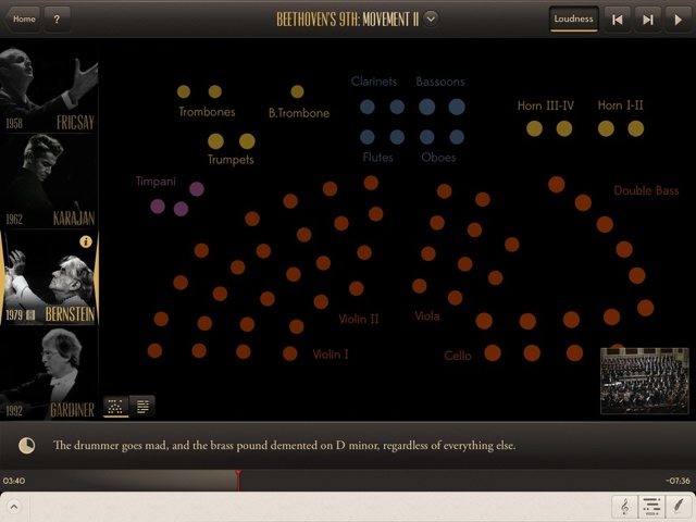
Beethoven 9 by Touch Press contains four different complete recordings of Beethoven’s 9th smyphony, the complete video with Bernstein, an interactive score, informative comments in sync with the music, busy musicians as pulsing dots, and lots of video interviews. You can even switch between the interpretations at any time to hear the different orchestras! This is marvelous and designed with so much passion and deep understanding.
As a side note, the executive producer Max Whitby is also the director of Hyperland – a 1990 BBC documentary with Douglas Adams and Ted Nelson. Watch minute 18 to see the grand grand grandpa of Touch Press' app.
From the Touch Press Blog:
Snapseed
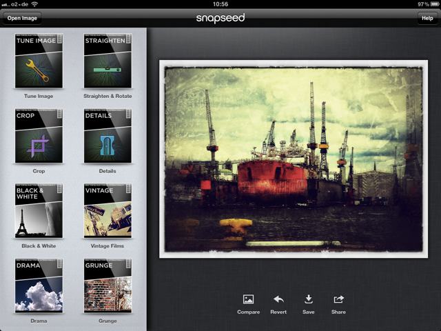
Snapseed is an integrated app for the post production of images and photos. The interaction model matches the properties of the touch tablet without being too fancy or too dumb. It is a joy to control and witness the process in which the pixels develop into some pieces of art.
[Update 2/14] NIK Software was acquired by google in September 2012. Since then the app is free – a good move to stimulate the photo sharing communities on g+.
Bamboo Paper
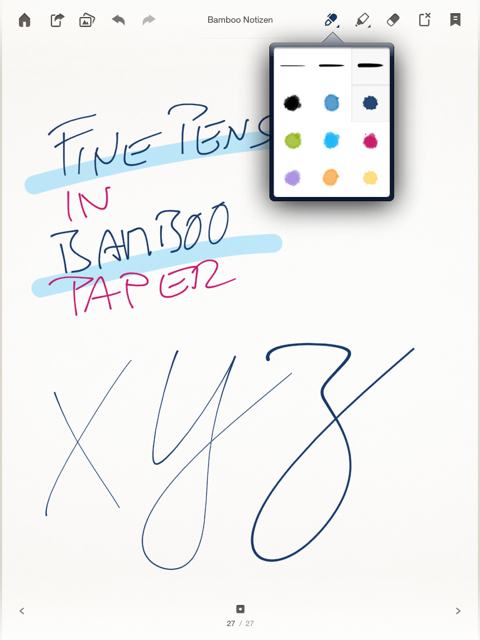
Bamboo Paper feels to me like a pre-installed app. I have it and I use it since I bought my iPad one and a half years ago. The technique how to transpose the movements of my finger into strokes behind glass is stunning – especially if you compare Bamboo with other finger painting apps that are obviously not capable of creating smooth lines. Josh Clark comes to mind who said, "we are creating the illusion that there is no user illusion anymore." This is very true for Bamboo. Only caveat is the launch time. It should bring you faster to the point where to jot down your thoughts. It used to be faster in previous versions.
Paper 53
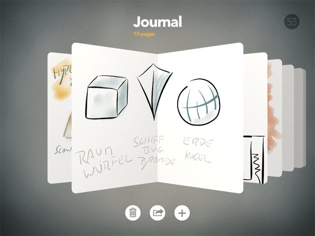
There is a saying: Don't give the users enough rope to hang themselves. Paper 53 does not. Paper 53 provides a limited set of brushes and colors, and as a result (almost) everything you draw looks great. It is a well designed app with tools that form a holistic composition. I have to point out the gesture for undo. It is a 2-finger drag – counter clockwise!
[Update 2/14] Hello Houston?! I would like to merge the sketch book from 2 iPads.
Liquid
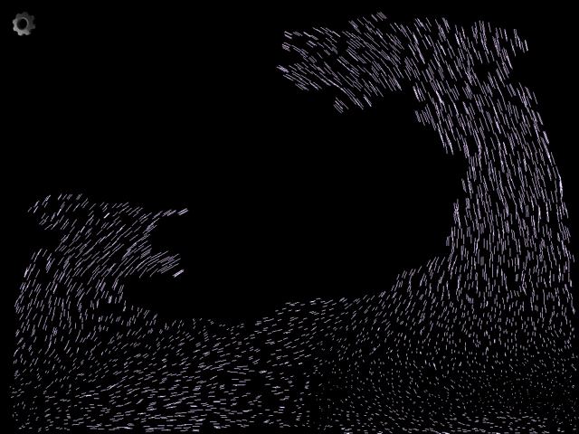
This is a wonderful example of a gravity-based particle system. Obviously it does not simulate water waves in a pond with Koi. Due to the gyro sensor the entire device becomes the vessel for several thousand of particles: Happy twisting and turning the iPad! Splish and splash with multi-touch.
Gravitarium 2
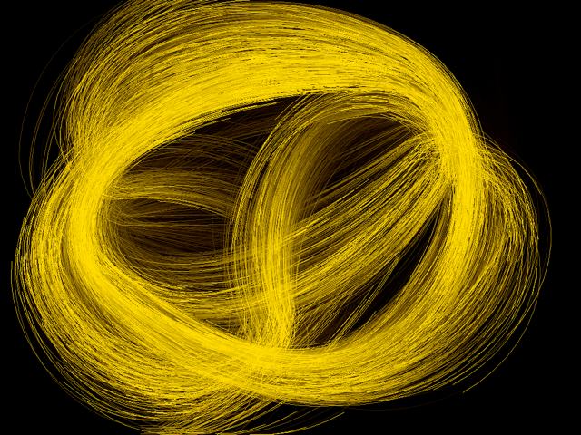
Apart from the fact that Gravitarium has nothing to do with the gravity sensor, it is multi-touch to the extreme. Use up to 10 fingers – or even 20 in duo player mode – to herd thousands of colorful particles. Like a sorcerer's apprentice exploring the master’s secrets, you experience the major power of your hands. Hey, interaction designers, there is so much fun beyond pinch and swipe. Go for it! The example above involves three fingers; in fact two more to take the screenshot. I hope you appreciate this artistic exercise.
Windharfe / Aeolian Harp
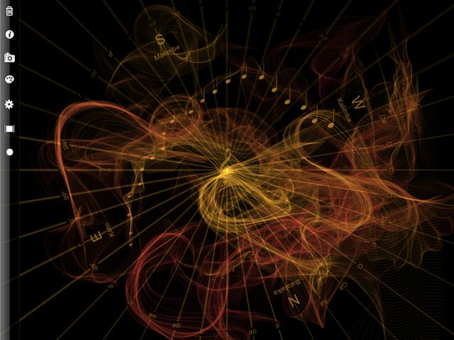
This is my first sound app. It is still one of my favorites. I love to sit on a bench in a park, iPad with head phones and play. Of course, it needs to be Summer! Marimba, Kalimba, Balalaika and Koto are arranged on a real compass. (This way I figured that my home is not in straight East-West orientation as I believed for years.) Touching or swiping over the spokes emits notes that wander and echo and fade over time. Very meditative.
Bloom HD
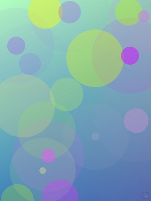
Bloom by Brian Eno and Peter Chilvers is a classic. Originally for iPhone, it is a conceptual beauty to play or autogenerate ambient music. Left and right touches go to the left and right channels. From bottom to top you climb up the scales. Do not try it if you are in a rush. Take your time. Start dreaming. And do not forget to set the sleep timer before :)
As Noted
Disclaimer: I am responsible for the design of As Noted.
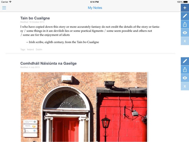
As Noted is a simple solution for cross platform note taking. It is available for iOS, Android, and google chrome on the desktop. Notebooks are shared via dropbox among all your clients. I guess I hold my breath now because this is my app. Check it out and decide for yourself. BTW we offer im&export with Evernote ;-)
As Noted | asnoted.com | @asnotedapp
Daedalus Touch
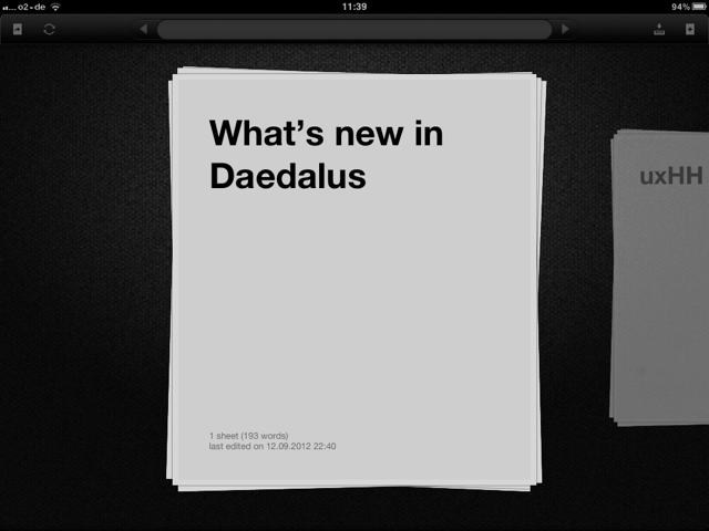
Text and touch interfaces are not made for each other. Or can you imagine to write Ulysses with a stick into the sand? Hence I see on-screen keyboards just as an intermediate step. Either they have to be improved a lot – for instance with force feedback to sense the keys or with chording gestures – or they will be substituted by speech recognition.
Daedalus has chosen and implemented so many elegant interactive elements that I forget about the deficiencies of entering text through glass. Swipe and pinch gestures are used to navigate between sheets of text. To that extend it feels more like a zooming UI than anything else. No images or doodles. Just text. Clear typography. Fun to use.
[Update 2/14] Daedalus for iOS 7 is still good. But it lost its specific charme due to a dull rectangular flat design. On the other hand, Daedalus is now a freemium app. Hence it is easy to check it out.
StockTouch
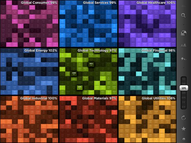
Numbers are dull, right? Well, it is a matter of data visualization if this is the case or not. StockTouch provides a colorful view into Wall St. Like in Daedalus, spread and pinch gestures are used to zoom in and out of market sectors and individual stocks – zooming is even accompanied by audio feedback! Swiping can be used to navigate between stock views. No, numbers are not dull as long as they are represented like this.

Waiting rooms and Flipboard are made for each other. It is a personalized magazine experience to browse though the pages of different sections such as your activity streams from LinkedIn, google+, twitter, tumblr, etc., or to flip though curated channels offered by the Flipboard team. It is more complicated than it should be to subscribe to any of your favorite RSS feeds; but once you've customized the list of departments, Flipboard turns into a well of inspiration and useful information.
[Update 2/14] I've stopped using Flipboad. Basically because I failed to migrate all my subscriptions to a new iPad. In theory this should be possible; but in reality the theory was really not usable for me.
Podio
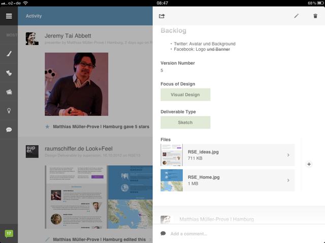
First of all, Podio is a collaborative web space. Second, Podio is the best and most flexible collaborative environment I know. It supports distributed teams by structuring the discussions of different aspects for any kind of project over time. If any predefined module does not match your situation, go and edit the fields. We use Podio to prepare IxDA sessions in Hamburg, and even for organizing the entire Space Ship Earth. Third, Podio has an app that simply follows the simple and powerful design.
SyncSpace
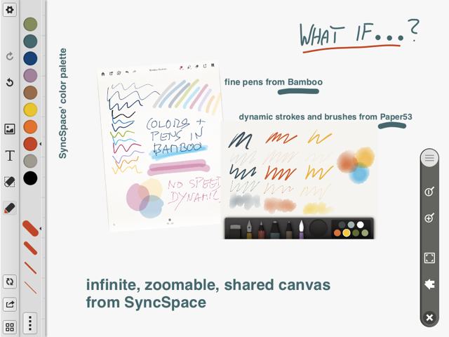
There is no reason why the edge of the screen should also be the edge of the virtual paper. There is no reason not to use pinch and spread gestures for endless zooming into the canvas. Well, it does not have to be as deep as the Mandelbrot set, but a few levels up or down can be helpful to switch context between details and the grand picture.
[Updat 2/14] Meanwhile, SyncSpace got a subtle face lift. But a smooth panning behavior is the biggest missing feature. Others do it with fractals live!
benjaminrabe /22 Dec 2012: SyncSpace is the new SketchShare. #infinitecanvas #collaborative / thx mprove for the pointer.
Artisan Paint
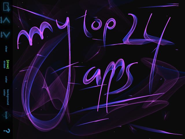
Artisan Paint is a simple finger painting app. The fun kicks in because the brushes are made of little satellites dancing around the trail of your finger. The result is quite dynamic and random. Therefore it is no disadvantage at all that the app does not change into landscape orientation; this way the Undo function is easy to reach, and you can practice with trial and error until you like the stroke.
Artisan Paint | Artisan Paint Light
ArtRage
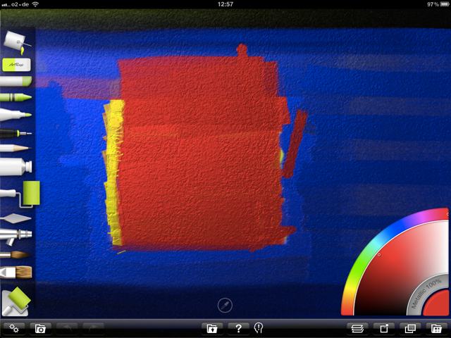
I do not paint with oil on canvas, and I would never try while riding the underground. It is a different story with digital finger-painting. ArtRage’s digital brushes are quite impressive. The strokes are less random but therefore more permanant compared to some other apps on this collection. It is easy to get good results – spending more time lifts you up into the master level.
My current iPad wallpaper is done with ArtRage. And here is the corresponding Locked screen.
Popsicolor
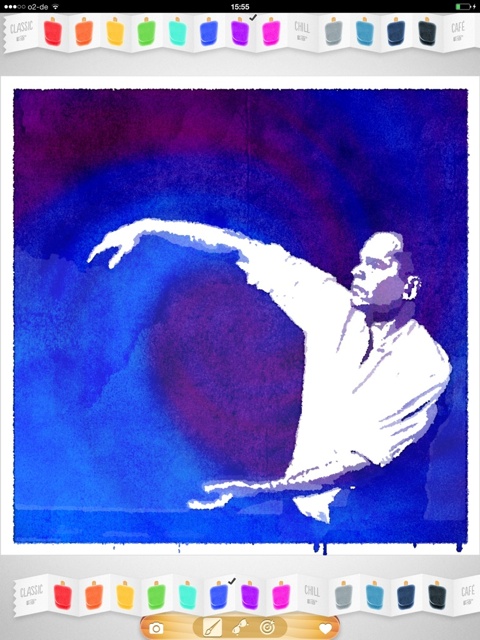
Popsicolor is a photo filter app to create aquarelle like images. You have to choose a pair of colors and a few other settings to turn your photos into something special. Only caveat: rendering should be a bit faster to foster playful experimenting. Visit my gallery of Popsicolor images.
Osmos
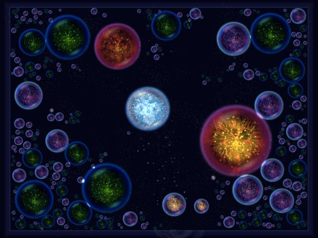
There won’t be very many games in this collection. Here is one exception. Osmos is a contemplative, dynamic, strategic game. By emitting matter you control a little amobia – sometimes a planet or star. Get big, eat the enemy. Do not get eaten or absorbed. Beautiful graphics. The game is also Game Center enabled, which injects a bit more intelligence and intent into the opposite cell.
Soundrop

Hello friends of minimalistic apps. Soundrop is so simple that it defines an entire category of generative sound apps. Little drops fall down the screen and bounce between the lines. Adding and adjusting the lines changes the rhythm and melody. Simple and complex, but not chaotic at all.
Physynth
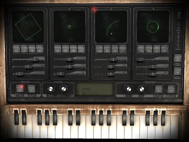
Imagine Soundrop with 4 mixing channels and a hyper-realistic user interface. Physynth look gorgeous, much like an ancient synthesizer. Each channel defines a separate bouncing pattern that can even be set into rotation. The piano keyboard is used to insert new notes into the mazes. If you are not so much into music apps then the wonderful transitions between UI screens remain impressive. Term to remember: skeuomorph user interfaces
ThumbJam
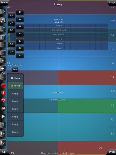
The best to say about ThumbJam is that it makes me curious to explore the world of music on the iPad. The number and quality of included sampled instruments is impressive. The number of scales is a cultural journey around the globe. FYI there is more than major and minor! I’ve configured the screen above to play Hang 1. More layers are added for Hang 1.1 and Hang 1.2. MIDI support allows other apps to interact with ThumbJam.
SoundPrism Pro
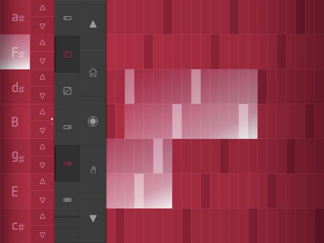
The touch screen seems to be a wonderful playspace to explore new concepts and layouts to play music. SoundPrism divides the screen into two areas with a control bar in between. The modifiers adjust the number of octaves that are played at the same time, the horizontal length of the white bar; and the accords from a single note to a triad, the height of the chiming area. The collection of available sounds is limited in the free version, but more sound packs can be purchased. I prefer the Pro version because of the MIDI support. For example, this makes it possible to play ThumbJam’s instruments with SoundPrism’s user interface.
Orphion
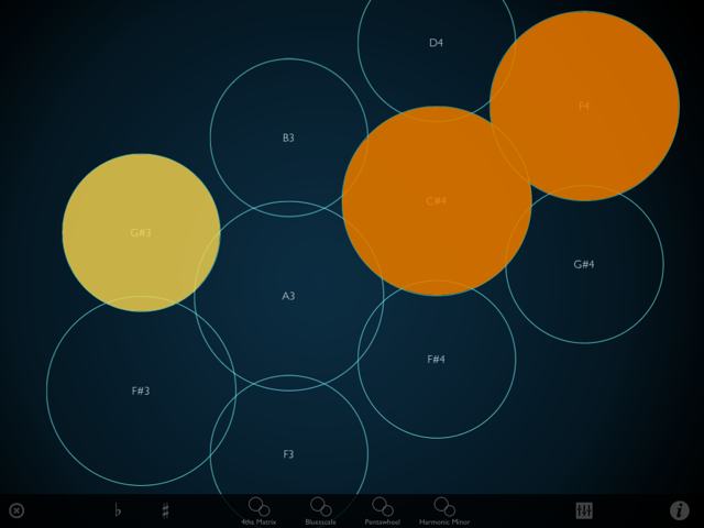
I could not believe what’s going on here. Still on my first generation iPad it already feels like a fifth gen touch device with pressure detection. Touch softly to produce soft sounds – hit hard for loud and tinny sounds. Stunning. Bastus Trump did a splendid job developing this new digital instrument.
[Update 2/14] Bastus was demanded by Apple to remove the app from the app store last year b/c Apple did not like the way Orphion uses the shape of the touch to play loud and soft sounds. What a silly decission! But your can still enable and enjoy the effect by double-tapping the version number in the about box.
Orphion | orphion.de | Orphion meets Moog | Bastus at Soundcloud | video tutorials
- BTW here is a little tutorial how to customize and connect Orphion with ThumbJam to play a Hang on iPad.
Seline Ultimate
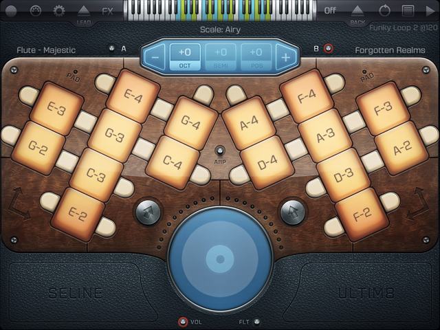
This app looks cool, and it sounds even better. A good collection of samples can be assigned to two banks. The layout of the keys is very ergonomic, and it allows to play very harmonic melodies with ease. My favorite is the Majestic Flute one octave down, with lots of echo (delay) in a large concert hall (reverb). This reminds me of a live concert with Al Di Meola; his percussionist came back after the break and gave an increddible duet with himself (echo/delay) whistling on beer bottles!
[Update 2/14] I've used Seline for a little jingle for a recent presentation – check it out at the Multivisionswand – OK, AudioBus and JamUp Pro had also been involved. The timpani is coming from ThumbJam (above) and everything was recorded and mixed with MultiTrack DAW. Do you think that this was too much effort? Maybe, but fun!
MirrorWorld
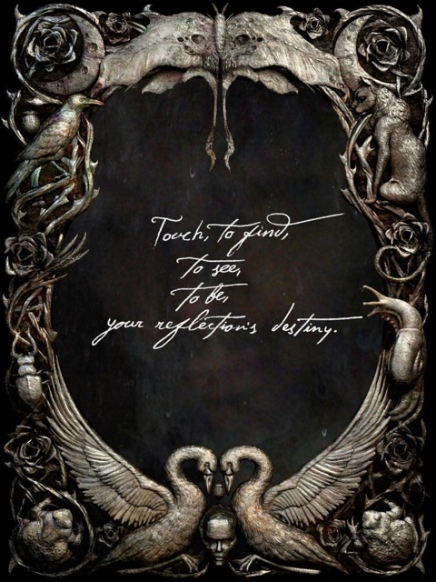
What a spooky selfie. But you have to enter the world like Alice through the magic mirror. MirrorWorld is Cornelia Funke's first virtual book. Storytelling at its best. It is surprising and delightful how the iPad becomes a looking glass into the story. Read or listen to the chapters full of ogres read by Cornelia herself. Listen or watch Cornelia's webcast on Words and Images at Reeperbahn Festival 2013. More screenshots
MirrorWorld | MirrowWorld by Mirada
MetaSquares
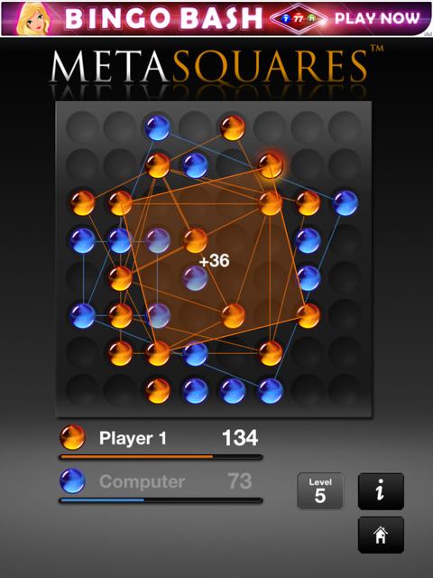
This game is a long time companion. I believe it was distributed together with KPT Bryce in the 1990s! Scott Kim developed the game concept – the design comes from Phil and Kai at Meta. It would be wonderful to see many of the KPT Tools on the iPad. However, history took a different turn.
Coming back to the game: simply build more and larger squares than your opponent. That's it. "Easy" and elegant – apart from the ugly ad banner on top.
[Update 2/14] Still no update regarding the ads. It would like to see a version without the nasty advertisements.
But frax by Kai Krause and friends was released in 2013!
AppShopper
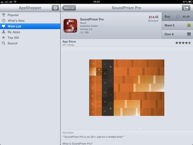
AppShopper is was an app to browse and look for new apps. Furthermore it has a wish list that sends notifications when a price has dropped. It is not a beauty in itself, but it is extremeley usefuly and it helps to save a few bucks.
[Update 2/14] The app is no longer available. So I had to move on to the web version at appshopper.com. Still good. And it saved me quite a few bucks since.
SkySafari 3
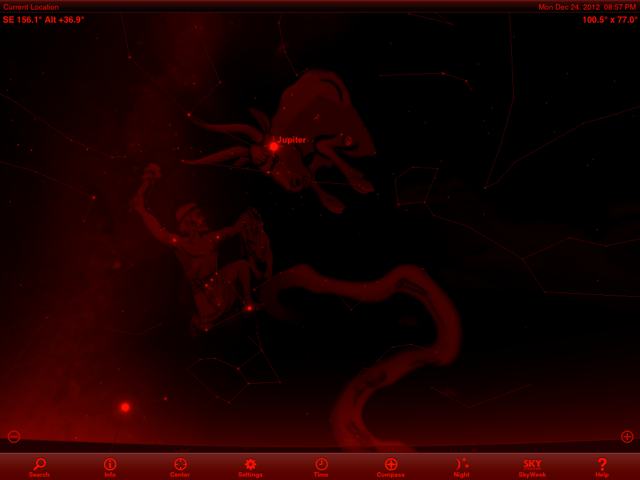
SkySafari provides an augmented view into the sky. Using the sensors, the sky is shown correctly for the point of view of the iPad against the firmament. The red night view prevents your eyes from being dazzled by bright lights.
SkySafari 3 | SkySafari Plus | SkySafari 3 Pro
dannie /24 Dec 2012: now I can not wait until my iPad arrives. Merry Xmas!
à propos
Feedback – please leave a message
 hci.social/@mprove or
  norden.social/@chronohh
 mprove@acm.org
- More channels
