The Blank App :: gray
The layout of apps on your smart phone or tablet is not clever at all. In fact it is likeley that you have a total mess; with the only advantage that you got used to your own mess. The problem exists since the introduction of the iPhone and the problem was never addressed with any system update. The rules are based on the assumption that the best app layout follows the western reading order top left to bottom right. (For right-to-left locales iOS apps run from top right to bottom left. [PCWorld 2015])
What’s good for text is not good for the order of apps on the home screen as well. The top most row of apps is read first, recognized first and therefor most prominent –– but the top of the screen is the most difficult position to reach with your fingers on a smart phone. As long as this bahaviour is carved in the operation system, we the users have to deal with it.
Here comes a little trick, that might tame the mess a bit. Simply add a blank app here and there to cluster your apps or to start a new row of apps were it makes sense to you. To do so, save this page to your home screen. It does nothing but providing a blank app icon.
Step 1
Choose an icon with a lightnes similar to your home screen or folder background; click now:
Step 2
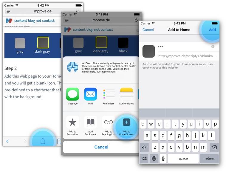
Add this web page to your Home Screen, and you will get a blank icon. The name is pre-defined to a character that blends well with the background.

Feedback – please leave a message
 hci.social/@mprove or
  norden.social/@chronohh
 mprove@acm.org
- More channels