The Interface of Kai Krause’s Software
Matthias Müller-Prove,
Phil 19-Oct-2023: Such great times... still proud of the work we did and grateful to Kai Krause for his intense mentorship and access to the world we traveled together with the team we built, all of whom remain the best of friends to this day. Always fun to revisit this evergreen academic piece by Matthias Mueller-Prove too...
Contents
- Meta-History
- The Software
- Maximize the Interface
- Full Screen Mode
- Rooms
- Minimize the Interface
- The Desktop
- Kai’s Interface Language
- Unfolding functionality
- MouseOver
- MouseDragging instead of Value-Slider
- Memory Dots / Five Favorites
- Transparency & Shadows (KPT Lens f/x, Poser)
- Full Screen Mode, Rooms Metaphor
- Workspace – Desktop
- MetaWindow
- References
Meta-History
CV
Kai Krause [today: kai.sub.blue]was born 1957 in Dortmund. He came to California in 1976 with two friends. He worked as a musician for Disney Sound Effects; the sound track for “Star Trek: The Movie” was created on his synthesizers*. * In fact Kai won a Clio Award for his sound effects in a Star Wars radio spot. Emerson, Lake & Powell bought sound systems from him and he is still working with Peter Gabriel today in order to fulfill his vision of visualized music as 3D sculptures. [Truong97]
He was running a forum for several years on AOL: Kai’s Power Tips & Tricks. He gave people tips and little pieces of code on line, simply because they shared his passion for computer graphics. This became an extensive and valuable collection of practical information how to get special effects with Adobe Photoshop. It can still be downloaded from several web sites. [KaiTT]
The Company
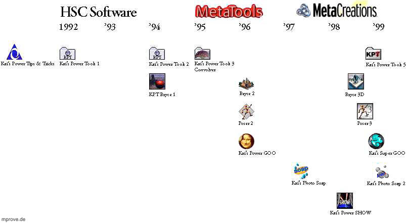
Fig. 1 Timeline with companies and products
Harvard Systems Corporation (HSC Software Corp.) [also Happy Software Company] was founded by John Wilczak. Ben Weiss and Kai joined him in 1991 at HSC and created the first version of Kai’s Power Tools. KPT is a set of plug-ins that use the Adobe Photoshop programing interface for 3rd party filters. Many ideas from Kai’s Power Tips & Tricks get implemented as simple and easy to use pieces of software. KPT evolved until version 3 in 1995. This release contains the Texture Explorer, the Spheroid Designer and KPT Lens f/x among others. Convolver came out as a separate product. HSC was renamed to MetaTools, Inc. the same year.
Eric Wenger and Phil Clevenger came into the team to develop a landscape-simulating product called Bryce (named after the Bryce Canyon). They started creating other kinds of software starting with Kai’s Power GOO, Kai’s Photo Soap and Kai’s Power Show. Before GOO, Kai was well known only by computer artists as a creator of creative tools. With GOO, Kai became noticed by a much broader audience. People played with GOO. The complex and difficult algorithms are well hidden by the interface. Even children can change images of their classmates or teachers to funny caricatures. Kai himself calls this sort of computer programs funware.
In 1998 Phil Clevenger and Kai managed to transfer the main interface concepts from Bryce to Poser3. Poser was originally created by Fractal Design. The companies MetaTools and Fractal Design merged in 1997. The new company was named MetaCreations Corp. In 1998 it had about 300 employees. The main office is in Santa Barbara, CA, [in Carpinteria to be more specific] but several other facilities e.g. in San Francisco, are part of MetaCreations. [MCRE]
Update π-day 2018
- MetaTools Flyer 1996
- Life in the Universe (1997) – course material by Victoria Vesna, UCLA (Thanks to Christopher Cowan for sharing the link.)
The Software
Maximize the Interface
Full Screen Mode
Kai describes how it came to the large dialogs in KPT3: Vorwort zu KPT 3.0 von Kai (S.10ff)
»I would love to interact with the image in the way that Levels or Curves does, but the plug-in interface as of today simply will not allow it. What that leads to is simply that the plug-in gets a rectangle and is supposed to do something with the pixels in some other room and then give them back.« [Kai95]
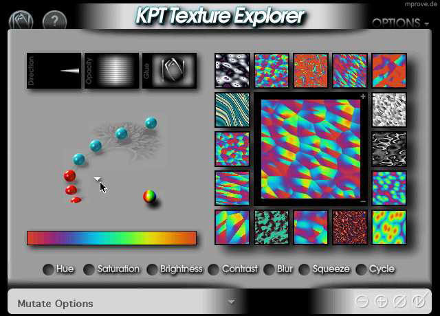
Many of the filters in KPT3 like KPT Texture Explorer, KPT Spheroid Designer and KPT Convolver use a rectangular area that fits on a 14" monitor. All other elements get blacked out – no menu bar, no Photoshop image window and no desktop. The user experience is really like coming into a room with a special suited environment for one specific task.
Fig. 2 KPT Texture Explorer 3.0
KPT Texture Explorer is a modal dialog, that is especially prepared to create textures and nothing else.
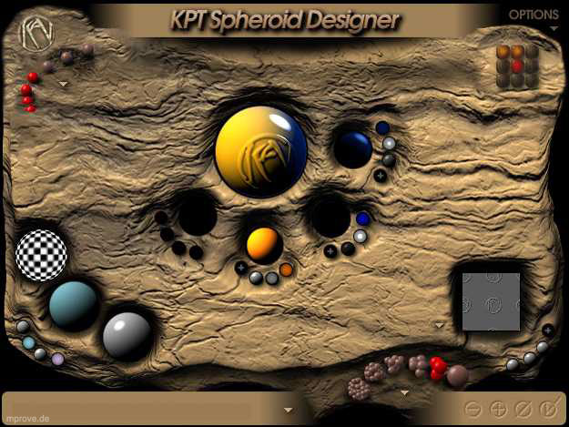
Fig. 3 KPT Spheroid Designer 3.0
KPT Spheroid Designer is meant to create collections of special looking orbs. Different controls allow the definition of light or to select a special surface structure for the orbs. The KPT users manual notes that Spheroid Designer may seem to resemble glass balls dropped into mud, but actually it’s meant to be glass balls embedded in an “old stale brownie”. [Lombreglia97]
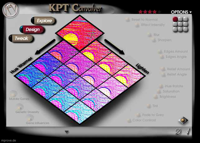
Fig. 4 KPT Convolver
Bruce “Tog” Tognazzini writes about Kansei Engineering:
»Since the year A.D. 618 the Japanese have been creating beautiful Zen gardens, environments of harmony designed to instill in their users a sense of serenity and peace. […] Every rock and tree is thoughtfully placed in patterns that are at once random and yet teeming with order. Rocks are not just strewn about; they are carefully arranged in odd-numbered groupings and sunk into the ground to give the illusion of age and stability. Waterfalls are not simply lined with interesting rocks; they are tuned to create just the right burble and plop. […]
Kansei speakes to a totality of experience: colors, sounds, shapes, tactile sensations, and kinesthesia, as well as the personality and consistency of interactions.« [Tog96, pp171]
Then Tog comes to software design:
»Where does kansei start? Not with the hardware. Not with the software either. Kansei starts with attitude, as does quality. The original Xerox Star team had it. So did the Lisa team, and the Mac team after. All were dedicated to building a single, tightly integrated environment – a totality of experience. […]
KPT Convolver […] is a marvelous example of kansei design. It replaces the extensive lineup of filters that graphic designers traditionally grapple with when using such tools as Photoshop with a simple, integrated, harmonious environment.
In the past, designers have followed a process of picturing their desired end result in their mind, then applying a series of filters sequentially, without benefit of undo beyond the last-applied filter. Convolver lets users play, trying any combination of filters at will, either on their own or with the computer’s aid and advice. […] Both time and space lie at the user’s complete control.« [Tog96, pp174]
Kai told me that the Convolver name was one of his little jokes that stuck, with the code name surviving the development and beta phases and the product coming to market with the name intact. It's a play on the word convolution, which Webster's defines as "a complication or intricacy of form, design, or structure." Convolution means something much more specific in the imaging world. In the KPT Convolver manual, Ben Weiss ties the word convolution to image enhancement and the extraction of detail.
/from Kai's Magic Toolbox [1996, pp164]
Many of the interface ideas evolved from KPT into Bryce. It is a whole environment that covers the complete screen. It overcomes the limitation of a fixed 14" rectangle, because the interface scales itself to the according screen dimensions. The same holds for Poser3 and KPT5 as they were shipped late in 1998. Bryce 3D concept demo by Kai, 1996
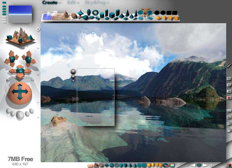
Fig. 5 Bryce 2
Rooms
»The writer John Updike is said to have several different writing rooms in his home, each used for a different kind of work -- a fiction room, a poetry room, a room for writing essays and book reviews. All writers want a special room for working (with door, without telephone), but why would any writer -- even such a deservedly successful and prosperous one as John Updike -- need entirely different rooms for different kinds of writing?
Actually, I know exactly why. Mr. Updike’s arrangement sounded great to me the first time I heard about it. I’m sure working in those rooms is his way of staying inspired, fighting boredom and distraction, getting creative work done by being in a space that’s not only set aside for work but that also somehow provokes that work, probably in quite subtle ways.« [Lombreglia97]
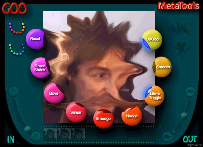
Fig. 6 Kai’s Power GOO
The GOO room is a specialized environment for shifting pixels around. But because Kai’s Power GOO is one of the first stand-alone applications from MetaTools some operating systems tasks like opening and closing images need to be accessible within the application. In order not to clutter the room that is special suited to edit the image, other rooms become part of the application. cf. An ode to Kai’s Power Goo, Macworld 11/2015
Unboxing Kai’s SuperGOO 1.0 E.g. Kai’s Photo Soap (Fig. 7) initially presents you with a series of seven “rooms” – In, Prep, Tone, Color, Detail, Finishing and Out – which one can enter to perform particular tasks.
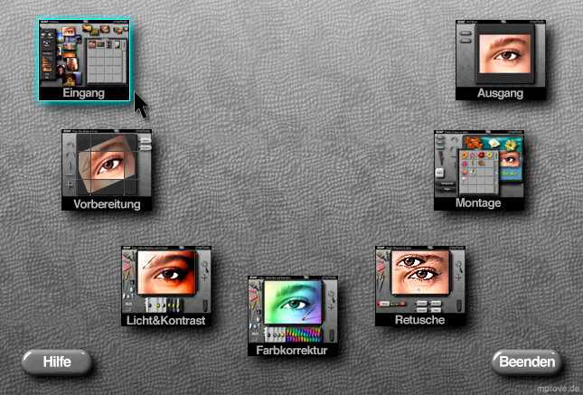
Fig. 7 Plan-Room in Kai’s Photo Soap
Minimize the Interface
The concept of Magic Lenses was introduced by [Bier et al. 93]. Two years later Kai designed a tool for KPT3 that can be dragged on top of an image. A circled look-through area shows a preview of the selected filter attributes.
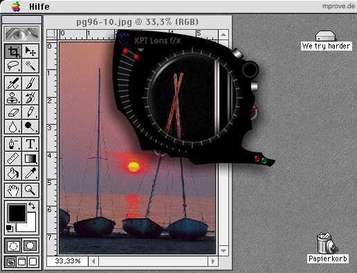
Fig. 8 KPT Lens f/x 3.0 on top of a Photoshop image window
Kai himself describes the design concept that lead to the lens tool in KPT3:
»What is called the “lenses” was in alpha known as the Dragon, as in “drag-on-the-image” and its design concept was so simple: make a precision instrument, like a little Swiss Army knife or a watch or microscope (it was also known as the fx Scope…) which has just a few very tiny controls around a center window. In this window a number of effects could be shown exactly as they would appear, over the real image, and updated in realtime.
It’s a lovely idea to keep all kinds of options hidden inside little wheels and dials that pop out to set and hide themselves during use… I think we have barely begun to use all the possibilities of that. And the actual interaction with the screen image is still a little clunky, hampered by the very illegality of bypassing the plug-in interface altogether.« [Kai95]
KPT Lens f/x explained in Kai's Magic Toolbox [1996, p.115]
Soap is the consequent next step into this direction. The tools no longer need to be modal like the KPT lens; they can be used in a very natural modeless manner. Pens, brushes and erasers are distributed all over the workspace. They are large, they cast real virtual shadows, and the tips of the tools get pressed down while they are in use.
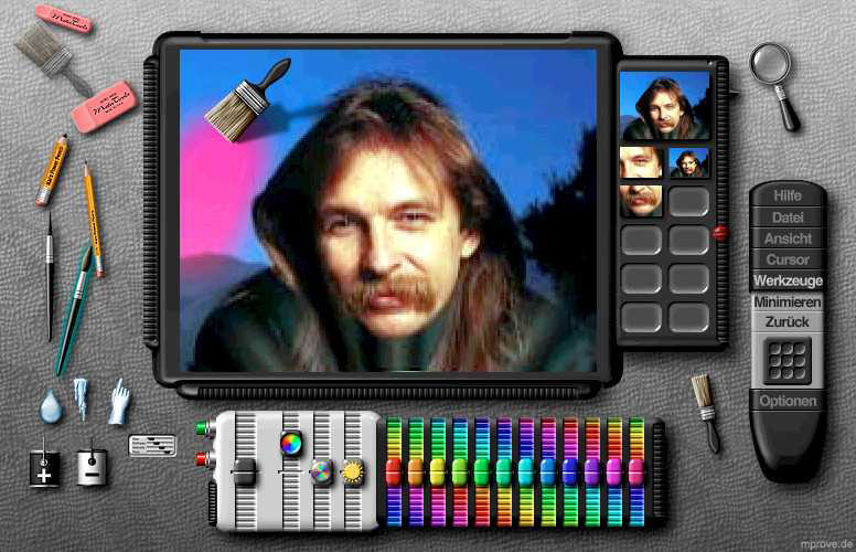
Fig. 9 Kai’s Photo Soap, the Color Room
The Desktop
The In rooms from Soap and Show are an attempt to deal with a large amount of image files. Large previews – compared to normal icons in Finder – can be distributed on a desktop area. They can be scaled and they can overlap each other. Selections of them can be stored into scrapbooks (Soap) or treated as pile objects (Show). The latter is a proposal to avoid the classical “file in folder in folder in folder” method. The stack of white images to the upper right in Fiufg. 10 is an example for a pile. Show live demo by Kai, 1996
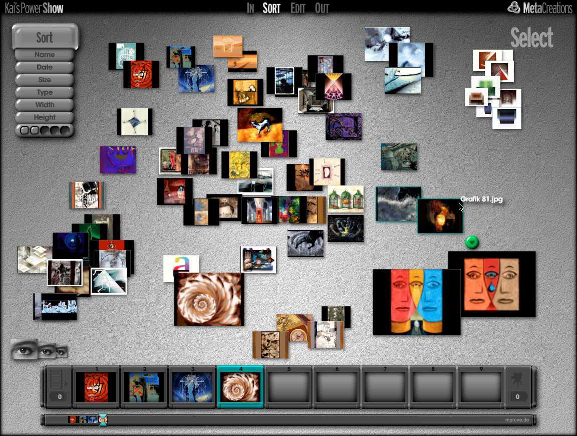
Fig. 10 The Sort-Room of Kai’s Power SHOW (zoom)
Update 2015
In retrospect many of Kai's user interface designs make perfect sense as iPad apps. Just imagine KPT Spheroid Designer or Kai’s Power Goo as an app!
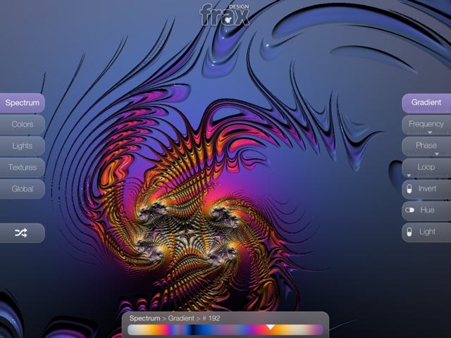
Ben Weiss, Kai Krause, together with Tom Beddard have created frax HD that was launched in October 2013.
Fig. 11: frax HD
Kai’s Interface Language
Unfolding functionality
Interface widgets become visible on demand. KPT Convolver has three modes: Explore, Design and Tweak. The controls that are not used for a specific mode are dimmed. (Fig. 4 KPT Convolver)
Pro
A rearrangement of widgets on mode changes is not necessary. The view remains familiar.
The user becomes curious to explore the interface.
Everything is accessible at once, because the mode changes if one clicks onto a faded item.
MouseOver
Tools fade out if they are not in use. If the mouse cursor is moved over these items they wake up. All the tools to the right and below the main view in the Bryce interface are normally invisible (Fig. 5 Bryce 2). The film strip, the camera and all other elements on the border of the GOO room increase in contrast when the mouse moves over (Fig. 6 Kai’s Power GOO).
Interface widgets get an explanation when the mouse gets moved over these items. (KPT, Bryce, Poser)
Pro
The view gets focused to the task. Distracting items are out of sight.
The Cockpit problem gets solved, because one can handle the numerous controls in larger chunks.
The user becomes curious to explore the interface.
Better spatial arrangement of widgets, because the label is omitted. (Bryce’ toolbar)
MouseDragging instead of Value-Slider
Classical sliders and scrollbars use a thumb, that can be dragged to a specific value. KPT3 or KPT Convolver use simple orbs that serve as origin of a mouse drag action. (e.g. Hue, Saturation, etc. in Fig. 2 KPT Texture Explorer 3.0)
Pro
An orb and a referring label is less space consuming than a value slider.
Kai’s sliders provide real time feedback for the edited object, because the control does not display any feedback by itself.
The value space can be 2-dimensional, because the x- and y-direction can have a different meaning
Cons
It is very difficult to enter exact numerical values.
The control displays no feedback about the selected value.
Memory Dots / Five Favorites
KPT Spheroid Designer, KPT Convolver and KPT5 use 3x3 fields of memory dots. These dots can store different settings of other interface widgets. Soap and Show usefive dots for the same task.
Pro
The user can customize tools, store control values and can flip between different interface arrangements.
The access time is very short.
Cons
Memory Dots provide no visual feedback. One has to activate the dot to recognize its content. An icon or MouseOver-Preview might be helpful. The film strip at GOO provides such feedback already.
Transparency & Shadows (KPT Lens f/x, Poser)
Note, this is years before Mac OS X Aqua. Nearly every item in Kai’s interfaces drops a smooth shadow. This is part of the kansei attitude of building harmonic environments.
Modal dialog windows from GOO, the menus from Show and the information palette from Soap are translucent.
Pro
The object underneath the pane remains visible.
Full Screen Mode, Rooms Metaphor
Pro
Design in every respect – Kansei Design
Special suited environments for special tasks support that task perfectly.
No window clutter
Cons
Only one room at a time can be active.
There is hardly any interaction with other programs. They are not visible; therefore drag and drop is not possible. One is no longer aware of other “rooms” on the machine.
Workspace – Desktop
GOO has only a gallery in a grid for images. Soap and Show (Fig. 10 The Sort-Room of Kai’s Power SHOW) use a more drawn out version of a desktop to display collections of media files.
Pro
Better implementation of a real life desktop.
Previews are very useful to recognize imagefiles.
Cons
Very limited for hierarchical structures
Arrangements cannot be stored for later use.
MetaWindow
Windows without classical borders and handles (Poser3)
Drawers, that reveal assets or functionalities on demand (Soap, Poser3)
Scrapbooks, that store objects (Soap)
Pro
This is an obvious way to get a hierarchical level into the interface.
Things, that are not needed every time, are only two clicks away.
And they are living happily ever after…
Quite so. Kai Krause left MetaCreations in 1999. The same year the company was renamed into Viewpoint Corporation to focus on MetaStreams, a 3D-Web technology.
Some people consulted with Apple to make a huge impact on the new Aqua design of Mac OS X.
google Picasa was designed and developed by meta folks. And Adobe Lightroom is a powerful product for digital photography.
Eric Wenger is designing and developing 3D landscape and arts software at his own company U&I software.
- IIIF is the open source spin-of of Seadragon by Blaise Agüera y Arcas, Ben Weiss, Ian Gilman.
- Ian Gilman on github
- IIIF is used by the author of these lines at Chronoscope Hamburg and Chronoscope World to provide high resolution historical maps.
Check out MetaTools, MetaCreations, Meta...? to trace more of the meta careers.
References
- [Bier et al. 93]
- Bier, Eric A. et al: Toolglass and Magic Lenses: The See-Through Interface. In: Proceedings of the Siggraph ’93. (Computer Graphics Annual Conference Series) (1993), pp73-80. billbuxton.com/tgml93.html
- [Kai95][2]
- Krause, Kai: KPT3 Help, A Note from Kai. MetaTools, Santa Barbara, CA, 1995
- [KaiTT]
- Krause, Kai: Kai’s Power Tips & Tricks.
- [Lombreglia97]
- Lombreglia, Ralph: The Genie in the Machine. www.theatlantic.com/unbound/digicult/dc9704/dc9704.htm, 1997
- [MCRE]
- MetaCreations, Inc., Santa Barbara, CA,
www.metacreations.com - [Spiegel 41/96]
- Kleine Mozarts. In: Der Spiegel. 41 (1996), pp230-233
- [Tog96]
- Tognazzini, Bruce: Tog on Software Design. Addison-Wesley, Reading, MA, 1996, www.asktog.com/books/tosd_detail.html
- [Truong97]
- Truong, William: An Interview with Kai Krause. http://wtproductions.com/digitalcult/featuredartist/kkrause/fainterviewkai.htm, 1997
Incoming links
- Interaktionsdesign, University of Uppsala
- History of Photoshop (in Greek)
- persistent info: CSS/DOM based Draggable Magnifiers, May 2004
- INTERFACE ./ Bump Top™ 3d Desktop Prototype
- User Interface Conservatism versus Liberalism, TidBITS, Jan 2011
- What is the history of drop shadows? Quora 2011
- What are some examples of famous/effective skeuomorph UIs? StackExchange 2011
- Wikipedia: MetaCreations
- Custom Watch Faces by daringfireball, April 2015
- Former Apple Design Gurus Criticize Apple’s Current Designs. TidBITS Nov 2015
- InfoDesign Hand-picked since 1997
- Boris Müller, Frank Rausch: Menus, Metaphors and Materials: Milestones of User Interface Design, June 2020
- KPT by Alchetron
- Hacker News, YCombinator, 10/2023 –– with 92 comments and counting
Hi YCombinator Hackers! Nice to cu.
If you are into time travel, you might like to check out my time machine Chronoscope World to browse old maps and billions of heritage documents. The UI follows some of Kai’s patterns.

Chronoscope Demo (5 minutes)
broken incoming pages
Arnie’s Graphics LinksLinks zu Mensch-Maschine-Interaktionvon Jürg Roost, Zürcher Hichschule WinterthurDokumentation Digitale Medien II; Seminar Kommunikationsgestaltung an der HfG Schwäbisch GmündDesign Crux: Design, Usability, Desirability, What’s The Difference?by John SoellnerPEAJJohn Mark Smeenk's Project 2 Website: Kai KrauseJD on EP: Software HistoryA surprisingly un-awful interface, How To Spot A Psychopath, May 2009Human-Computer Interactionresources by Dirk RichterA truly different and wild time
page that just took the images
- Kai Krause: More Than a Hero, a Validator /by Michael Darius, 2023
à propos
- What are the meta guys doing today? Check out MetaTools, MetaCreations, Meta...?
- Kai's Power Tips and Tricks for Adobe Photoshop
- Cool Quotes by MetaTools /1996
- Design ist die Entschuldigung für fehlende Ergonomie: Was haben eigentlich Ergonomie und Design mit Software zu tun? Hansjürgen Paul, 1998
- Kai's Power Controls, collection of widgets used in Kai's applications by Gerd Waloszek, SAP Design Guild, 1997
- MacFormat UK magazine Issue 77 (Spring 1999), a 4-page article titled MetaWorld, (excerpts)
- MacWord 30-Nov-1999: MetaCreations’ Puzzling Move – contains a corporate chronology as well
- Buena Vista Culture Club – Von Pixeln und interaktiven Zeitreisen /mprove 2023 (bi-lingual slides)
- Kai at TED8 /1996
Feedback – please leave a message
vga256: if you're a metatools/KPT lover as much as i was, and you're into software UI/UX design... matthias müller-prove's 1999 visual history of kai krause's software is ýÜ
 hci.social/@mprove or
  norden.social/@chronohh
 mprove@acm.org
- More channels
