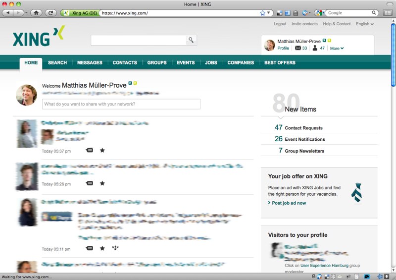
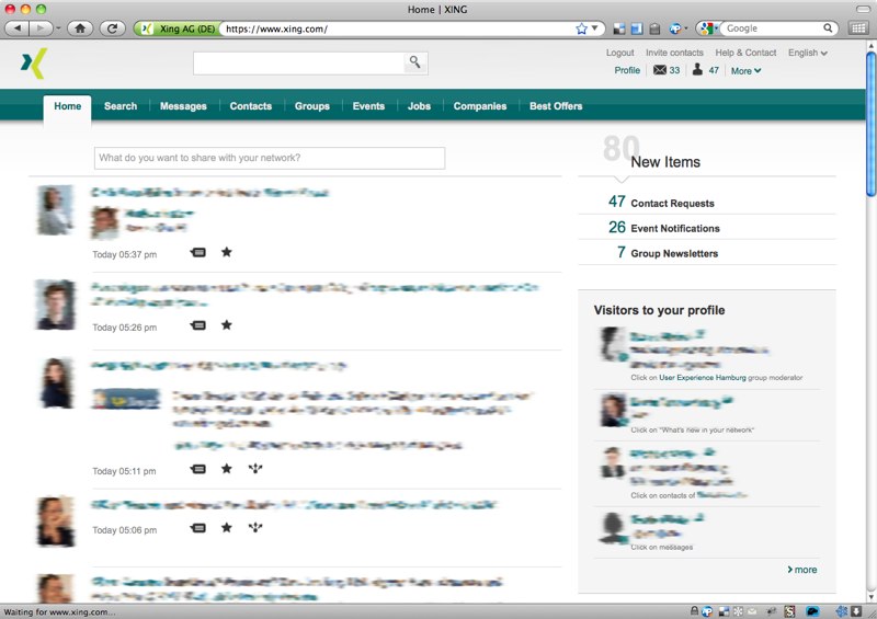
Xing’s recent relaunch introduced a couple of new features and design updates. I definitely appreciate that Xing continues to develop and improve my main networking platform. I would like to share my design hacks to get an even better usability with less clutter and more space for the content.
Before: Xing Home Page

After: Xing Home Page with Design Hack

- smaller height of header -> more space for content
- Xing icon instead of Xing logo -> reduced clutter in head section
- icon and name removed in head section -> I know how I look and I know my name already.
- capizalized silver labels in menu bar -> better legibility, friendly contrast
- reduced status box w/o my image, my name -> less clutter
- samller todo counter
-> It does not help me if it stops counting at 100. And why should I put myself under pressure all the time? - Removed Invite box -> This is a feature primarily for Xing, not for me. I can still invite people in the contact section.
- Removed Statistics box (not visible in neither of the screen shots) -> I know the number of my contacts. And the number of 2nd and 3rd order contacts is irrelevant for me.
- Smaller font size for time stamps and cause of contact (not visible in neither of the screen shots)
- Less dominant headings -> bold and gray
- More prominent location for button [Write new articles in this forum] (and AutoPager fix) -> on top of forum view
- Move message actions to top <- AutoPager support for endless messages
- Smaller icons in news feed
- Less hight for news entries
- Removed images of news entries of the kind 'is now connected to'
How to Apply the Design Hack?
How to apply the design hack in Firefox?
- Install Stylish for Firefox.
- Go to userstyles.org: xing.com – lean header and home page and follow the instructions.
How to apply the design hack in Chrome?
- Install Stylish for Chrome.
- Go to userstyles.org: xing.com – lean header and home page and follow the instructions.
How to apply the design hack in Safari and Opera?
The design hack can also be applied for Safari and Opera. There you have to create a local cascading style-sheet text file, and select it directly from Safari Preferences-Advanced-Style Sheet or Opera Preferences-Advanced-Content-Style Options. Here is my CSS:
@namespace url(http://www.w3.org/1999/xhtml);
@-moz-document domain("xing.com") {

/* https://mprove.de/script/10/xing/, 26-May-2011, v1.9 */

/* Removed Elements */
#myxing .user-pic, #myxing h4,
#welcome-box-container > a:first-child,
#welcome-box .smalltxt2nd,
#welcome-box h1,
li[data-activity-cat="7"] .activity-preview,
li[data-activity-cat="7"] .actions,
li.date:only-child,
#startpage-quickinvite, #stats-contacts, #content .col_one .teaser
  { display: none !important }

/* Header */
.logged-in { background-position: 0 -344px !important; }
.logged-in.pagepeel { background-position: 0 -304px !important; }
.logged-in #header { height: 60px !important; }
.logged-in #main-logo {
  background-position: -108px 0px !important;
  padding: 0px !important;
  top: 10px !important;
  }

#header .usearchform { top: 14px !important; left: 200px  !important; }

#myxing {
  top: 25px; width: 255px !important;
  background: transparent !important;
  -webkit-box-shadow: transparent 0px 0px 0px !important;
  -moz-box-shadow: transparent 0px 0px 0px !important;
  }

/* Menu Labels */
#nav-main a { text-transform: capitalize !important; }

#nav-main .selected a,
#nav-main strong a:hover,
#nav-main li.hover strong a,
#nav-main li:hover strong a { color:#006567 !important; }
#nav-main strong a { color:#ebebeb !important; }

/* Welcome Box and Counter */
#welcome-box {padding: 0px 0px 15px 80px !important}
#welcome-box-container {padding: 0px !important}
#welcome-box h3 span {font-size: 42px !important}

/* News Feed */
.activity-item > .actor > img {
  width: 46px !important;
  height: auto !important;
  }

#news-feed .activity-item { min-height: 90px }
#news-feed li[data-activity-cat="7"] { height: 75px !important; min-height: 75px !important }

/* Info Text */
.meta-info,
.smalltxt2nd
  { font-size: 9px !important; }

/* Group Header */
#content #gr-header h1 { color: #dfdfdf !important; font-weight: bold !important; }

/* buttons: New Article, message actions */
button[value="write new article"],
.message-action,
#delete-button {
  position:absolute; left: 65%; z-index: 10;
  }
button[value="write new article"] {top: 296px;}
.message-action {top: 140px;}
#delete-button {top: 130px;}

/* End of Xing Design Hack */
}
How to apply the design hack in Internet Explorer?
No way. Change your browser instead.
