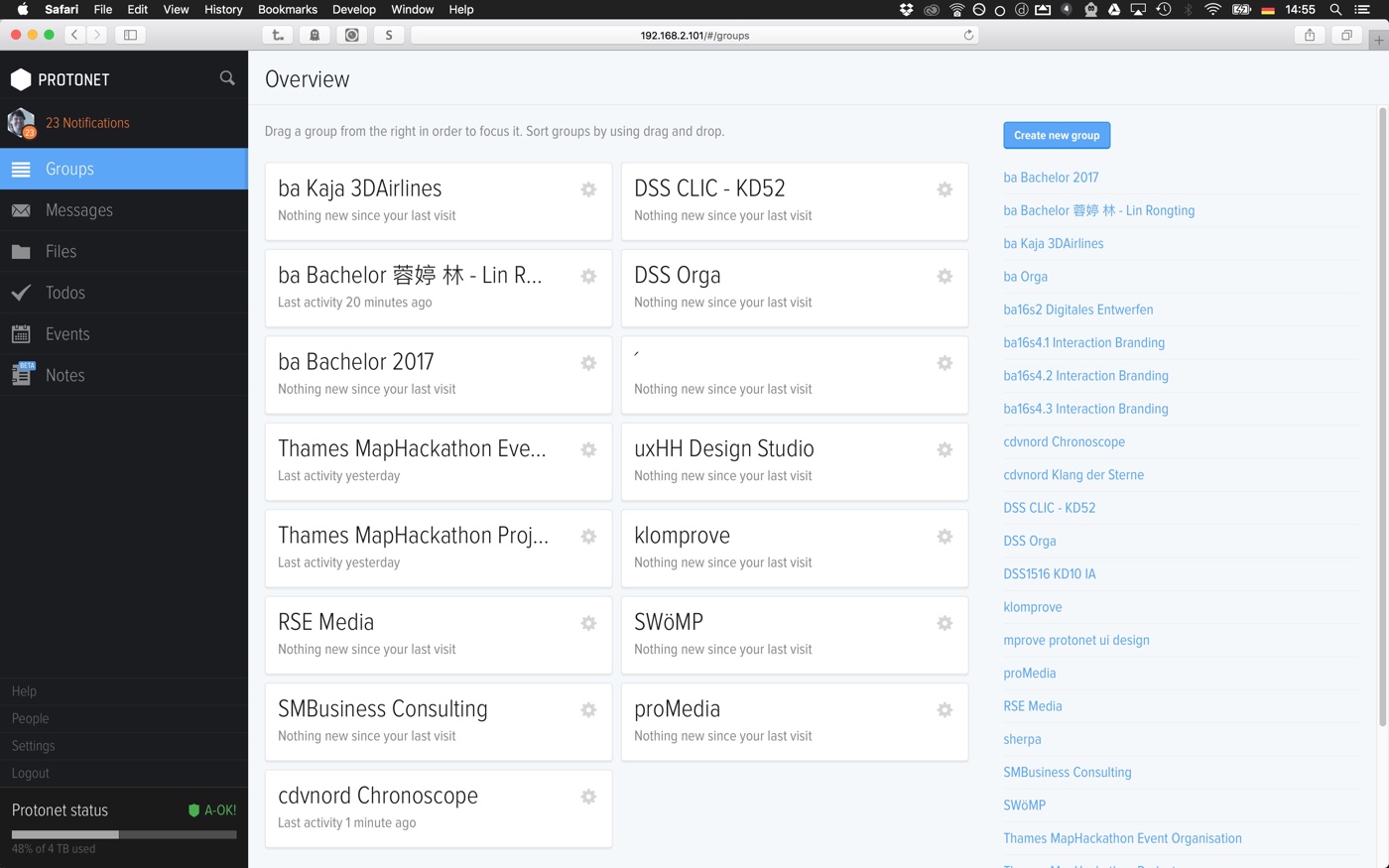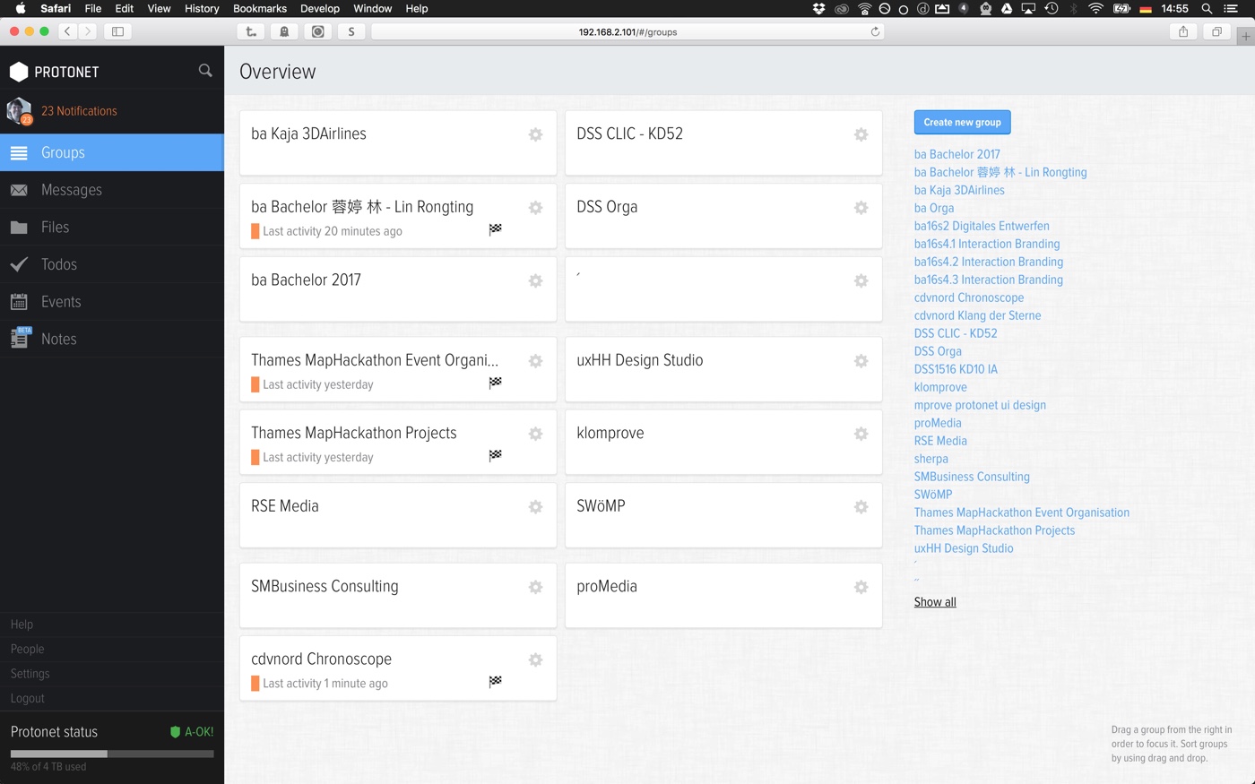

The following elements have been touched to improve the usability of the page:
- Don't tell the user that nothing is new since the last visit.
- Color mark and flag for groups with updates.
- Clustering of groups into column layout instead of matrix layout. Does anyone remember the article The magical number 7 plus minus 2? That's why chunks of groups of 6 groups is easier to digest and remember than plenty of groups in sequential order until the screen is full.
- Smaller group titels. They are still large enough for for legibility and headline style. But now there is moew white space and long group titles are less often truncated.
- Less line heigt for the list of all groups on the right leaves more space for more groups.
- The help text has been moved to the bottom right. Once you know that you can move groups from the list to the main area and arrange them by drag'n'drop, the line of text is wast of space.
Go back to the main article to get the CSS code.