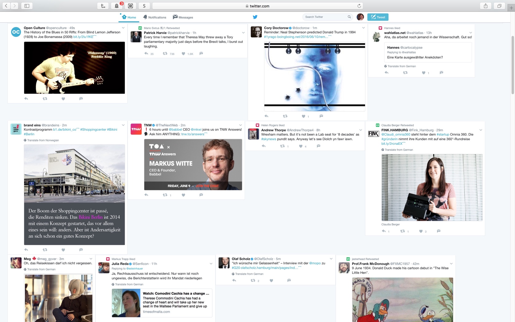
twitter design hacks
v0.9 –
Have you also payed a whole lot of money for an extra large monitor and have you asked yourself why you only get a narrow timeline at so many so-called social media websites?
Here comes a CSS hack to change the layout of twitter to a flexible card design.
pros
- 300% more tweets per screen
- 300% less scrolling to get the tweets
cons
- a few overlapping cards
- dosn't work anymore after twitter’s redesign 2019 – but you can install a browser extension to keep the former engine alive: GoodTwitter
All this is work in progress and a working proof of concept; and I like to get your feedback on the idea.
twitter flex layout CSS
how to apply the design hack?
You can apply the design hacks in your desktop browser:
Chrome and Firefox
- Install GoodTwitter browser extension
- Use Stylish for Chrome or Stylish for Firefox and copy the code.
SafariCreate a local younameit.css file and copy the the css code into the new file.Activate your custom styles at Safari > Settings > Advanced > Style sheet
Feedback – please leave a message
 hci.social/@mprove or
  norden.social/@chronohh
 mprove@acm.org
- More channels
