 Collaboration Media for OOo’s UX Project
Crossposing from GullFOSS
Choosing the right communication channel
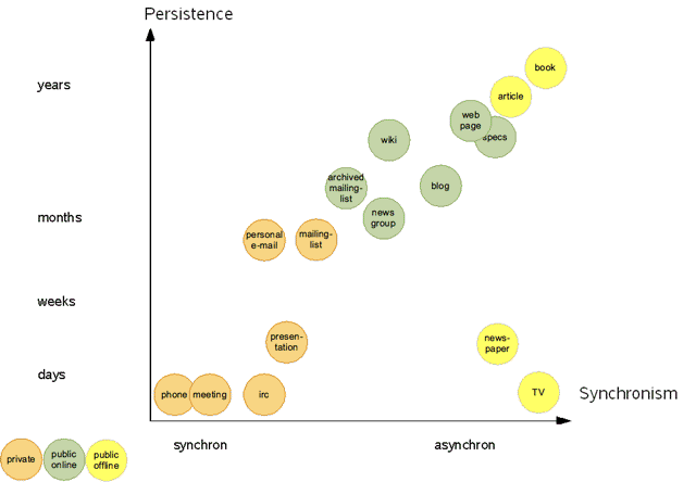
Inspired by Martin's posting on communication channels along the dimensions synchronism and persistence I created my own point of view and nudged the circles around quite some inches.
I am still wondering what is the preferred way to communicate in an open, transparent, and fast fashion at the level of iTeams. What’s missing is green(public) channels in the left(fast) part of the field.* *Sounds I am predicting microblogging here.
Update Nov 2009
User Experience Cyberspace Is 4-dimensional
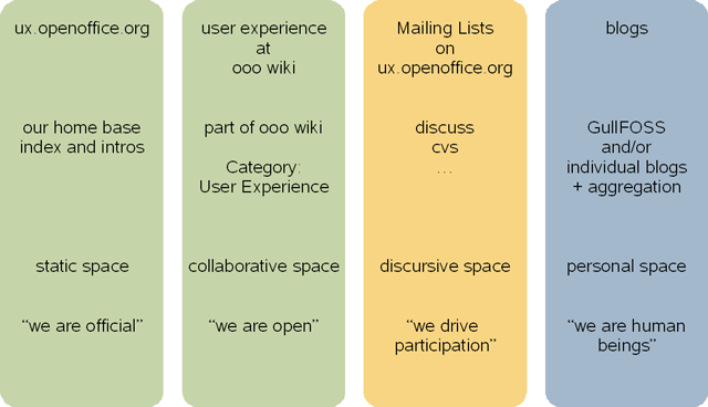
Gee -- catchy titles seem to work. I can see the question marks all over your heads. OK, back to the serious stuff. We are working on a strategy for the new User Experience project on OpenOffice.org. Several communication channels need to be balanced in order to use our energy efficiently to achieve an optimal outreach and involvement of the open source usability community. And now let me introduce the 4 dimensions of user experience communication:

The page at ux.openoffice.org is our official home. The way this site is hosted makes it a bit cumbersome to grant write access in a way that supports contributions. Therefore we will use the OpenOffice wiki as a space that invites people to collaborate on topics that matter to improve the usability of OpenOffice.org. A third channel of communication is our mail alias (and newsgroup) discuss@ux.openoffice.org. This medium is well suited to actually drive the discussions because the messages find you and tend to start glowing in your inbox. Last not least, blog postings on user-experience shall also be used to inform the OOo community and to attract folks from the blogosphere to our project(s).
User Experience Cyberspace Has 7 Dimensions, maybe 8
Thanks for the responses to my Friday article on the 4 dimensions of User Experience. Esp. to Sophie, Bernhard, and Frank. (As long as we are a limited sized group, everyone will be greeted by a virtual hand-shake.)
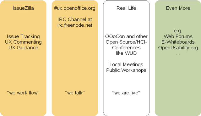
Bernhard indicated that there are some more dimensions to consider. You know what? He is right. Today I present 3 other important communication channels that matter in the user experience cyberspace.

First is IssueTracker (aka IssueZilla). This is the task tracking system used for OpenOffice.org. Lots of our UX contributions happen in IssueTracker. We submit bugs with a special focus on usability. We evaluate and comment on issues. And in cases where we write the specification, we add the URL to the task. To sum it up, IssueTracker provides the infrastructure for the development workflow. No feature, no bug fix goes into the product without an associated issue in IssueTracker. For us it remains an ongoing challenge to keep on top of it; and to gain the big picture of what is changing over all in the product.
We already had some initial conversations over our new IRC channel: irc://freenode/ux.openoffice.org. IRChats are a very synchronous medium. Very fast. High energetic, Very much fun and very prompting. I attended a meeting of the Mac porting group some time ago. So even moderated meetings are possible. We might try this for the User Experience project as well.
Real Life. Remember that? The stuff outside when you leave the Matrix? We hope to meet you in person on many occasions. Of course, OOoCon is the first choice, but other events like the World Usability Day might fill the time in between.
There is more (collaborative) space to explore and to utilize for our purposes. And I keep in mind, that I haven't answered Bernard's question yet; that was: "You should think of a place for graphical contributions." Yes, right. Let's discuss if we have a well suited spot for media files in our user experience universe, or if we need to add an 8th dimension to our ecosystem of communication channels.
McLuhan was an Information Architect
Q for today: What's the relation between Marshall McLuhan, “The medium is the message”, and Information Architecture?
With my recent posts I've presented a couple of communication channels and “cyberspace dimensions” that need to be filled with life. Each of those channels can be seen as a medium that transforms the message that is transmitted. This means in turn that there are good and bad media channels for certain kinds of messages. I call the choice of well suited spots where communication and collaboration can happen applied McLuhanism.
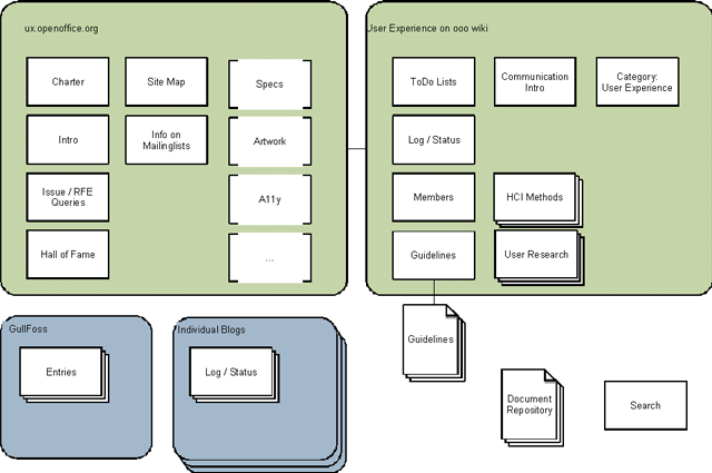
The term Information Architecture is used for the organization of content, functionality, navigation and usability of a web site. The following illustration uses Jesse James Gerrett's visual vocabulary to outline the architecture of the user experience space on ooo.

Top left we have the website at ux.openoffice.org, The message that changes every piece of information is: “This is graved in stone”. Well, more or less. At least it is a space that is not very hospitable because just a few people have full write access to the site. Nonetheless, it is an official site where we will put official information that does not change every other week like our charter and some general How-To guides. Links point the visitors to related projects, e.g. to the specification project and the accessibility project.
The wiki (top right) is by design a collaborative space. And our pages shall be no exception. Working documents and pages where everyone is invited to contribute are here. The stack of guideline documents that seem to be hosted outside the wiki is a nice example that the index page to guidelines can be well done as a wiki page regardless where the actual guidelines are located.
Of course, the details will be filled in over time. But on the way this map provides guidance for informed decisions where pages should go best to foster participation.
à propos
- User Experience for OpenOffice.org. interfaces #71, British HCI Group
- Community Experience at OpenOffice.org. interactions (Nov/Dec) 2007
- Social Enterprise Tools. Beispiel Sun, Intranet Summit Zürich 2009
