#12 Colorization: This is for Ted Turner..........NOT
Why?
Life is short and then you dye. And, because you have been bugging me about this for 3 months now.
What?
Color is a major ingredient in Photoshop. No doubt. No wonder.
Unless you're stuck in some 60s Pop-art phase, you will want to meddle with hues. As it happens, PS has an amazing array of very powerful methods to deal with color, many of which may be entirely new to the mythical "casual user", but I will also try to dish out a sprinkling of ideas that live up to the "Power Tips" moniker I slapped on myself.
How?
Under the guise of Colorization, lets get something gray on the screen first and then see how many ways there are to add hues. As a little bonus I will start this one off with an old technique which is really fun if you haven't seen it yet. And even if... Some of you learned this in an impromptu chat with me in October last year, when I first explained this one. I also saw Russell Brown use it a few weeks ago. Credit goes actually to some guy in Berlin who had a molecular display system in the early seventies and published this as a short cut technique to draw 3-D molecules `real quick'. His system did this with thousands at a time and I remember being very impressed by the life-like 3-D look. As it happens, it is extremely easy to adopt in Photoshop.
1. Go to File > New and make a window 400 wide, 300 high in grayscale. Could be any size of course.
Very much like in the Instant Sphere document, we're using the Blend tool now. First we reverse the colors:
2. Go to Window > Show Palette, which pops up in the lower left. Default is `foreground' ("Fore" in the pop-up), set to black. Set that to white via the sliders or by picking a white box.
3. Set the background (pop-up to "Back") to black in the same manner.
4. Now double click on the Blend Tool (to the right of the Paint bucket), which launches the Blend Tool options dialog. Make two changes: set it to "Radial" and "Lighten Only".
5. To erase the Untitled-1 window, double click on the Eraser and click ok: a solid black image.
6. The magic can begin: select the Blend tool and click on point A , then drag to B, roughly...
fig 1)  fig 2)
click-and-drag from the center to the edge of a sphere
This is very smooth in grayscale. In fact if you see any dithering in these, try 256 grays, but later color examples require the color settings. 24 bits is the only way to go really. Please upgrade. Do it for me....
fig 3)  fig 4)
Create a second sphere; so far all normal...but then the third one in between the others...
fig 5) 
Instant molecular docking spheroids
Some say that it's the cheap way to create simulated ray-traced plasticine rodent cartoony figures. Disney lawyers: have your machine call my machine.
The effect is very simple in operation: the edges of the third sphere overlap previously drawn sections and since "Lighten Only" is selected, the blend tool simply stops sphere creation at those edges, resulting in a striking imitation of shaded balls joining in almost sensual ways.
So now you can go to town, playing with 3-D lego blocks and dock `em anyway you like. Here is what it looks like if you run amok for 1 minute:
fig 6a)  fig 6b)
The Boobonic Plague (1204-present) Elespherant (one tenth scale)
7. Now back to the topic, lets say you have a few of these things on the screen, in grayscale. Lets examine what we can do on the color front. First, simple colorization and then explain a few things later. This one is provided in the archive, in case you want to play along:
fig 7) 
Pearls of Wisdom (swine not shown)
8) Goto "Mode", which should be checkmarked "Grayscale" now, and switch to "Indexed Color". The image will look the same at first, as if nothing has happened. But it did....
9) Now you will find that under Image > Adjust the menu items 4 and 5 are no longer greyed out. Choose Image > Adjust > Hue/Saturation, the last menu option.
fig 8) 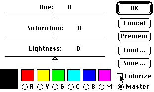
The Image > Adjust > Hue/Saturation dialog:
10. Click on the "Colorize" checkbox, then move the Hue slider...and voilá, instant colorizing action...
It will take you a little while to get the hang of how these, things are all interrelated, but once you know it is mega powerful stuff.
fig 9a) 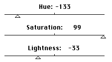 fig 9b)
Example settings of the sliders and the resulting color image
In the above example, all three sliders were moved to create the blue spheres. In order to better explain, let me add some pictorial elements to illustrate what's what...:
fig 10) 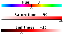
The Hue/Saturation dialog with visual help for your edification (smooth in 24 bits)
Think of the Hue slider as "WHICH Color" and the above rainbow shows where each color falls. (somebody running the ResEdit Power Tips section ought to add this right into the dialog, although one gets to remember by heart where they fall fairly quickly). As you see, it wakes up on red, and turquoise cyan lies at either end of the spectrum.
Think of the Saturation slider as "How MUCH Color", with the 100% solid full color at the far right `100' and no color at all on the far left `0' setting. Notice that where you wake up at 50 is NOT the full red available, so move that middle slider to 100, first thing.You can move from grayscale smoothly to full color.
Think of the Lightness slider as "How white are the highlights in the overall color range". At the 100 setting everything turns totally white. At `0' its all black.
11. In the example of 9b) the spheres at first are pale red. Moving the Hue slider to -133 selects Blue, moving the Saturation slider to 99 brings it to full saturated Blue color, but the highlights are fading towards white. Moving the Lightness slider to -33 adjusts that, so the brightest areas are now a light blue as well.
Tip >>> as with all realtime dialogs, clicking in the title bar area acts as an Instant Compare with the original setting..! I couldn't live without this feature...
Essentially these sliders try to navigate you through the 16 million possible colors in the RGB color space. Together with all the other color options we'll cover soon it does a very nice job of accessing these shades as well. You will need experience to find the settings to get there, but it can be done. For example, to go for a pearly soft rosy tinge one would do something like this:
fig 11a) 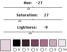 fig 11b)
dialog settings for the pale pearl "rosy" color, which the future is supposed to look like
You can back into this logically to an extent, for instance that you need to pull back the Saturation slider or else the colors are way too strong and the Hue slider has to move from Red towards the Pinks and Purples.
The small movement of the Lightness slider is very essential to get the right range of colors. Otherwise the highlights would have been very bright white.
Tip >>> the 6 sample swatches at the bottom turn into an instant display meter in the "Colorize" mode. Watch them as you adjust the Lightness slider to judge very quickly whether the highlights are where you want them. And read hues and saturation range there as well. We will revisit them...
Note: the control here is quite smart: it excludes true grays completely from the action! Only the Lightness slider will affect them. Black and white are not part of the hue spectrum.
This is the most primitive way to go from mono to color, getting a single tone only. But before we advance into Powerland, a little basic info, some theory and background are called for. Yeah, yeah, stop whining. Sit up. Listen. Chewing gum in line, ehhh? I hope you brought enough for everybody?
12. Let's talk about modes for a second. There are several basic modes for Photoshop to operate in. You can read up on the theory in the manual/book, but for practical purposes, here are some other viewpoints: RGB has 3 channels with 8 bits each. Work in CYMK if you can, as that adds another channel just for the black parts and is more accurate for print work. Things do slow down, though, as you have 4 channels now. For the most part, I work in RGB. It is suggested that you pick your color space beforehand, since the conversion can have some surprises and artifacts popping up.
Indexed Color is another beast altogether: it is the `CLUT' mode: a "Color Lookup Table", which means there are only 256 colors total (8 bits) for use, that's it. The advantage is that if you have only an 8 bit card this looks great to you, and also, since there are so few colors involved, one can redraw the colors very quickly. Trouble is, 256 colors ain't enough. Believe me.
It may sound to you like "gee I couldn't even name 25 colors, so what do you mean ten times that isn't enough? And what is it with this 16 million color crap? I bet you can't even see that many..." Arguments of that flavor have been floating around for a long time.
Fact is, this is pure semantics. Sure you may only have names for a few colors, but when you look at a Navel Orange and call that color `orange' you are referring to hundreds of shades of orange! If you try to reduce the subtle shades down to just 256 you are beginning to get in trouble. And then of course 3 other shaded objects enter the scene and something's got to give...
But Indexed Color mode has more problems: none of the soft edged tools will work in this mode, nor will any of the Calculate, Effects or Filter operations. You are reducing Photoshop to almost nothing...
13. What I find is really not very well understood at all is that Photoshop works in 24 bits even if you have only an 8 bit card. Many people end up in Indexed Color mode merely because they don't like the dithering effect that shows up immediately when converting to RGB, on an 8 bit card. What happens is that internally PS will generate everything in full 24 bits but shows a dithered 8 bit preview. So:
What you should do if you have an 8 bit card (or using the internal 8 bit video on a IIci etc) :
a) run, don't walk, to upgrade to a 24 bit card. Seriously, you will never look back. You will, like me, curse yourself for not having done this a long time ago. I upgraded first to a full screen 1024x768 screen in 8 bits, then added a second 24 bit small screen, then jumped to a 1180x870 24bit card on a 21" Trini. Every upgrade seemed like a godsend. MetaTip >>> I found that in high res refresh is a serious issue. After using 75 Hz on the 21" Thunder there is no way back to the 60Hz...Also, fixed frequency monitors (e.g. the 21" SuperMac) seem much less prone to flicker than MultiScans, so unless you really really need the switching..... (Of course, while you're at it, go to at least 8 meg memory and more if you can to experience great benefits with PS., but that and other money drains are another story altogether)
b) Do most of the work while you can in grayscale. This looks equally good on an 8 bit system, because it's really a CLUT with 256 greys in it. Then add color, as we will cover here, in half a dozen different ways. Now: Switch to RGB, do your stuff, disregarding that it looks badly dithered, and, at will, transform Mode > RGB to Mode > Indexed. Use the default, Adaptive with dithering, and PS will build a histogram of your image, determine the most important 256 colors and then dither them for the best possible 8 bit image. Now, be ready to either UNDO this right away (I have one finger permanently glued to command'z'...) or do this with a Image > Calculate > Duplicate of the RGB file. You can also save the 8 bitter.. Think of it as a fairly good preview of the real effects inside. It is important to understand how and when to do this.
By the way this also applies if you want to see a 24 bit file. Say you download a KPT example image (I just added QT pict updated new images up there, (Use the More button to scroll down to see them) and it comes up in 24 bits, dithered. Then Mode > Indexed Color... will build the best 8 bit preview for you, certainly a LOT cleaner than merely gawking at it in dithered mode. If you have not done it this way before, go right back and look at them again, fill out the feedback form all over and really mean it when you send me love letters. Or take back a few of the threats, whereever you fall in the range.
Ok, this may have been less than Powertippy for many of you, but remember when you discovered this for the first time.....I may make an incredible difference to some of you. If you think you belong to that group, read it again. (more details, send me a note to account 71333,3542)
14. Onwards in the color world: I start with the gray Pearls (e.g. use File > Revert) and convert to Indexed Color again. Now go to Image > Adjust > Color Balance and launch the dialog. No need to click on Colorize or anything, this will instantly start to tint your grayscale image.
Actually, there are 3 times 3 slider settings in this dialog (Oddly, no Load/Save here...something to consider if you need to affect multiple images) Top to bottom here are Highlight , Midtone and Shadow settings.
fig 12) 
The Color Balance dialog unfolded into the 9 sliders it contains
15. This is the effect these settings are achieving: (again, this is VERY smooth in 24 bits and you can just barely make out the subtlety in 8. But I didn't want to make everyone suffer the least common denominator syndrome)
fig 13) 
after applying the Pearls-to-Cherry converter
While it may look like plain red at first glance there is actually quite a variety of shades in here: a dark ruby red, midtones with a crimson component, some orange in the lighter shades and a white highlight with blueish halo. In larger files you would be able to make this out more clearly, but believe me it's there. Point is, Color Balance can essentially tear the color components from one another to create such subtle multi huedness. Or is it Hueidity...?
16. Some notes on this: the realtime action happens immediately, but it will affect all images in all windows on the screen. Use Preview to see clearly what's going on.
Tip >>> On 24 bit cards you will notice that the realtime action seems to go away. Use "Option-Preview" to regain that state. (True for all dialogs with `Preview')
Tip >>> There is no outright "Reset" button, as you would find in the Arbitrary Map. But you can use the little known "Option-Cancel" to reset everything without leaving the dialog.
It is important to understand that it is not the absolute setting of each slider, but rather the relationship between them that creates the effects. If you moved all three from 0,0,0 to 99,99,99 you would literally see no difference whatsoever! Try it.
17. The tricky part here is that for exactly that reason you can't just move each slider one by one and be done with it. They all influence one another. You will need some experience how to deal with each set of three as a group to fully use the potential in this dialog. It's not particularly hard, but not trivial either. There are a large number of settings that will result in `blooming', banding and other color artifacts that are not desirable except for rare special effects cases.
Note also that the settings are `relative' rather than absolute: if you exit the dialog with the `red cherry' setting and return you will find all nine sliders set to 0 again, waiting for you to set further relative offsets of the color components.
18) By the way: the dialog looks identical in CMYK mode, but since the color gamut is quite different the results will also change! To witness:
fig 14) 
same cherry setting in CMYK mode, more like grapes, really
19) I can't go into color gamut theory at length (as Woody says to Diane in bed: "Not now...Not here"), but the two minute description: Print is using inks to achieve colors by addition, and that is the idea of 4 color printing with Cyan, Magenta and Yellow able to create the spectrum, plus a black layer for gray components and solid black. The screen on the other hand uses Phosphors to create the spectrum by subtractive means via Red, Green and Blue. There are a number of high intensity R,G,B shades that are simply not possible to create with ink and are not within the `colorspace' or `gamut' attainable by CMYK. Conversely there are subtle shades in the 4 color process that do not map well into RGB.
You can see some of the dilemma if you open the Info Window, which reads out both ways, and moving along a smooth gradient notice how the numbers do not increment evenly.There are gaps...
The image in figure 14) is not an exact demonstration of CMYK, by the way, merely a caveat of the settings of the dialog. Using fig 13) and converting from Mode > RGB to Mode > CMYK would yield a near matching image, without maybe quite the intensity. During print one can bring this back in the ink choices.
20) My suggestion for the above two dialogs is to use them in combination: either start by getting the overall contrast right, eg. fig 130 has the right 3-D sphere'ness factor, the highlights are snappy the blacks are deep and dark, no banding, etc. and do that without ANY regard for the hue itself. Concentrate only on the tonality. Then afterwards go to Image > Adjust > Hue to rotate the color spectrum.
Other times you may need to do this the other way round, i.e., get the right color first, then adjust the balance. It is important to understand that while Color Balance can in effect change color, too, and Hue can change tonality, that's more like using a screw driver to hammer a nail. Know your tools!
We have covered 2 methods of direct colorizing so far. There are at least 6 more. I may need to chop this into pieces...? (Yeah, that's what happened later..read on)
21) The first two dialogs covered here are simply greyed out if your initial image is in grayscale. The next 3 are dialogs that are available for monochrome work as well, but they metamorphosize to color dialogs when accessed with a color image. My favorite one overall would have to be Image > Adjust > Levels..., even to the degree that I rarely use Color Balance any more, and certainly not Brightness/Contrast. All those can be emulated from within the Levels dialog and you would do well to get familiar with it.
In simple terms comparing it to Color Balance's 9 sliders, Levels gives you 20, and a Load/Save option to boot! Better yet, it has on the fly histograms showing you the distribution in each channel! Very useful....
fig 15 a) 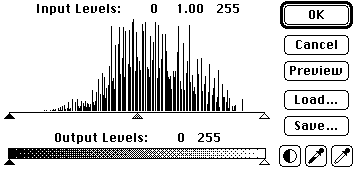
Image > Adjust > Levels...with a grayscale image
fig 15b) 
....and with added switching radio buttons when accessed with an RGB color image
22) There are 5 sliders (triangle handles for each) available for each of 4 modes. This adds controls such as `tinting with an overall green component' or `compressing the red range' which have no counterparts in the other dialogs, yielding subtlety in color gradients and overall tonal range that is unique.
fig 16) 
Levels...can directly create even more complex color schemes from mono sources
23) A few tips on Levels... lets look at one of the 4 modes and how the 5 sliders operate.
fig 17 a)  fig 17 b)
normal grayscale image and after 5 slider adjustments in Levels...
fig 18) 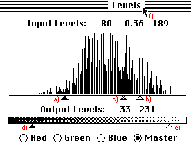
These are the settings resulting in fig 17b)
The sliders were moved in the "Master" mode, which is analogous to their operation in Grayscale, here it means affecting all three components R,G and B simultaneously. The action is similar in each single color.
There are 256 steps by the way, corresponding to the 256 (8 bits) in each channel or grayscale. The histogram shows a vertical line for each grayshade, i.e. each of the 256 X locations.
24) To start with the black triangle at a) It was moved from the far left to a setting of 80. Think of this one as
"Everything to the left of it is pitch black and as you drag it to the right, the more shades are turning darker"
What that means in this example is that the darker shades in 17 a) have been all re-assigned to solid black, accounting for the dark areas in between the circles in 17 b) You can see in the histogram in fig 18) exactly how many shades that included, look at the lines right above "a)"
25) The white triangle at b) has moved from the far right `256' to a setting of `189'. Think of it as
"Everything to the right of it is solid white and as you drag it to the left the more shades are turning whiter."
In 17b) you can see that that created the solid whiter center portion in each circle. That use to consist of light grey shades in 17 a), also visible in the histogram right above "b)" and they are all remapped to white now.
26) The middle triangle at c) would have normally started at the 1.00 position but then it would have travelled along with the other two being dragged and without intervention it stays exactly centered between the two others. It defines the linearity of the ramp. It normally has a range of 0.1 (all the way to the right) to 7.99 (all the way to the left), but this range can get smaller as is the case here. Think of it as
"From the lightest component to the darkest, it is compressing the range to more light greys if dragged to the left and more dark greys if dragged to the right."
In 17 b) it had the effect to further reducing the light grey bands, making a very narrow halo of greys around the white centers.
27) The black triangle at d) has been dragged to the right. Think of it as "Make the darkest shade not black but THIS shade" and then move it there. Same with e) "make the lightest shade not bright white, but THIS shade" and move it left... You can see easily in 17b) in the top corners that the centers are not pure white, because of the setting at e). Clicking in the title bar, as in f), will compare to the previous state, as always.
28) In the color version the operation is exactly the same, instead of White substitute Red, Green or Blue. E.g. moving the lower left `d)' triangle to the right, which adds a white component to everything in grayscale, will add a red component to everything in the red channel, moving the `e)' triangle will remove the white components or R/G/B components.
The only tricky thing is that these action have a visual effect that you will have to get used to. For instance: moving a triangle and removing red will result in a stronger remaining presence of Green and Blue, which will turn the image more turquoise/cyan like. You have to understand that you are not using a Cyan slider but you are removing Red and altering the mixture in the process...That simply takes experience. As much as I try to make this the `condensed experience' I can't quite download a brain dump. Thank God!
You therefore need to also understand that in order to turn something `orangey' you need to add Red and Green, or remove blue.
29) Now, once you do know all that, you can at will go about turning your vision into reality. The step from 17a) to 17b) e.g. from soft spheres to contrasty circles, can be done during colorization to achieve blue background with purple spheres with orange pink halos and yellow highlights..., which in fact is what figure 16) did in the first place...
Tip >>> a little known fact is that the Levels dialog allows the bottom two triangles to actually overlap one another, which results in a complete Invert operation!! you can see in fig 19 a) that the white triangle is now at the far left and the black at the far right....! This is good to know in grayscale, as you can perform an Invert right within the dialog, but in color it gives you an even wider range, because inverting a single channel, as here the Blue and Master, results in whole new color schemes, as seen in 19 b) Try it, works great! MetaTip >>> since the invert can mess up all other colors, including the dialog, desktop etc. you may need to use Preview to see it realistically. Then Option Preview to get realtime changes back...
fig 19 a)  fig 19 b)
The secret Levels Invert operation: overlap the bottom triangles!! In color, works in each channel....
30) Well, so much for the basics on Colorization. I'll call this "A" and add the other basic conversion methods in "B", and then, believe it or not, one gets to the good stuff in "C", because there certainly is a lot more to talk about. It's all a peculiar mixture of ground work and power tips, but you'll just have to live with that, won't you...
What are you gonna do? Send me a feedback note with other ideas? Ha! I double dare you...
Please let AOL, Compuserve, and Adobe know if you find these tips.
Happy Photoshopping, Kai Krause
By Matthias Müller-Prove. Modified:
5/1/20

