#14 Selections: Naturally, Darwin...
Why?
This may be one of the most important items in all daily Photoshop grunt work, and yet many people are missing the boat here. There are LOTS of special little things to know. Come on in. Get to know them.
What?
In almost any image being worked on in Photoshop you need to isolate a section such as an object or text and deal with it separate from the rest. There is a whole menu called `Select' to deal with this, as well as various marquees, lasso, magic wand etc. But there are many methods that are far from obvious and I hope you will come out of this with some real insight that you can apply almost every time you launch Photoshop!
How?
Well, let's start with the basics and work on up to the oh-my-god-what-is-he-babbling-on-about-now on the latter pages...
1. There are some shapes on a page. You want to turn some green and some red. You need.... Selections:
fig 1 a – e) 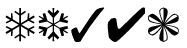
A few shapes (Zapf dingbat font just to make it easy)
Now, to turn that last figure, 1 e), red, there are many ways. As a holdover from MacPaint style applications many of you might jump to the fill bucket. Sure..that thing is just black, will take half a second.
Not so easy. First you convert to RGB mode, set the front color by clicking and picking (or better yet, use the Window > Show palette, pick & mix) and you click on the figure.
fig 2) 
Rats, only one petal turns red!
2. Ok, you are a man of the world. I mean, you've done it. You've slept with a... I mean slipped a variable or two in your time. You know how to fix this! So you double click on the fill bucket tool to get the dialog and you change the color tolerance from the default `32' to a more engrossing, say, `55'...Yeah that's it, that ought to fix it. Sure. Of course.
Click, click
fig 3) 
Rats again, now it's four...
Closer but not enough, obviously. Crank that puppy up some more! "99" it is...:
fig 4) 
Rodents ever more. STILL can't get those thin parts...
3. Well, now you figure "It's only 6 little strips, I'll just click on them directly..." and trying hard not to miss (old tips : caps lock to get cross hair, easier to see than bucket tool cursor, command `+' to enlarge window and see better. At very high magnification use New Window to get a second clone and leave that one at normal size)
Soooo, clicking away at the thin parts:
fig 5) 
argggh, it gets uglier by the minute
4. Now we have bloom and bleed and blancmange and there are even STILL little gray parts. This program is just no good. You are convinced that good old PixelPaint did this with more style. And you are very much mistaken. It is just not quite as obvious as a fill bucket tool. Admit it, you have done this. Hell nobody can blame you. It is the seemingly obvious choice. But the whole notion is flawed and what you need is full understanding what is going on here.
In Macpaint this all was trivial, because all pixels were just black or white. This shape would have been just black and easy to fill. Photoshop of course went the extra mile to give you anti-aliased edges and got you edgy in the process.
fig 6) 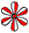
Enlarged view of the multiple greyshades in anti aliased edges
This, of course, is what you are really trying to get:
fig 7) 
All the anti aliasing and smooth edges, but in the color of your choice!
But how to get it...?
Plan B from inner space: "well, I would normally just use the lassoo and shrink right onto this thing... Photoshop doesn't even have a shrinking lassoo." Mistaken again.
5. Well, since this is all about selections lets quickly do the old shrinking lasso.
fig 8 a) 
If this is the shape you would like to lasso...
...all you have to do is to marquee around it (rectangular, elliptical or lasso) in a generous fashion:
fig 8 b) 
marqueed loosely...
now use the Magic Wand. As soon as you enter the marqueed area it will turn into a cursor, indicating that you are within the boundaries of a selection and you can move it around. If you press the command key however the magic wand re-appears and now it will function within the boundaries of the selection!
fig 8 c) 
and then command-click the magic wand...
This will select the white area inside the selection and leave the shape itself, just like any self-respecting shrinking lasso would have done. Most of you will have known about this before, then again, maybe not? Worth a third of a page anyway.
In fact, this method would fit the bill here, but really only because we have a simplistic case. You may have thought, "Gee, why not just click the magic wand right on the shape..?" and that's true, too. But the method up there works well even if you need to shrink around a whole bunch of separate items, such as this
fig 9) 
a whole lot of little shapes can be roped in easily...
A good example of a selection with multiple shapes is `text' after you exit the text tool dialog. And if you lost the selection around the letters, this would be away to get them back.
6. In a more complex example the normal shrinking lasso will not get interior enclosed holes.
fig 10) 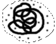
You need to experiment with the combination of `shift command wand'. There are lots. Simple repeated `command-wand' clicks inside the hole shapes will add each one to the selected area. `Shift command wand' acts quite differently. Luckily command-shift is immediately next to command `z' ("Undo") so you can try and see what happens. Photoshop is very forgiving and allows near perfect Undo (although only one step, so be careful. One click too many and you can't go back.) (Tip >>> learn to glue one finger onto the command z key...or F1, but that is much further away...) (It will be nice when Caspar voice input appears on the `93 Macs, then you can link Undo to something like "Ooops...")
In the example of fig 10) there is no easy way to add all the dots to the pretzel shape, nor to shrink down to them all without trapping the hole shapes. In fact using the wand there is NO way to get all this reliably.
7. So what would you say if I boasted it could be done algorithmically...(that is, without manual clicks or decisions about holes or regions..) and in about 5 seconds...? Hm..?
In fact there are TWO ways to do that even. Puzzles anyone..?
Here is a quick look at the Select menu, (note that some menu items would be grayed out until you have a floating selection...)
fig 11) 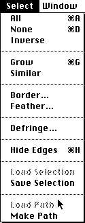
The Select menu...
8. The first method revolves around Inverse and Similar, both of which are extremely useful and much underrated in the casual Photoshopping crowd. In my non-scientific sampling during classes I taught there was an overwhelming majority of `insurance salesman style' blank stares when it comes to this stuff.
In this case we will exploit the fact that the figure to be selected sits on a flat color background. (Note: it is not in the least important whether that background is black, white or anything else, as long as it is flat shade)
First select a small patch of that background with one of the marquee tools. Here in fig. 12 a small rectangle is selected in the upper right corner:
fig 12) 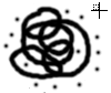
selecting the background pixels
As soon as the `marching ants' appear, the Similar menu command is no longer grayed out. Use it and presto!, everything that is the same shade as the background everywhere in the whole window becomes selected... Now all you need to use is Select > "Inverse" and all the black shapes, including the dots and excluding the holes(!) becomes selected. Voilà...
9. Two points: First, if you are not sure what is exactly included in a selection and it is hard to see with the marching ants, turn them off via command-h and then hit `delete' to clear everything (of course Undo that immediately) (plus this assumes that the background color is white. `Delete' clears to that color!) . You can then see readily if you have erased all that ought to be included in the selection. In particular if you didn't catch certain fringe regions, such as anti-aliased edges, you will then see them remaining as `dirt'... Its a very usable technique.
Second, it is not immediately obvious that the `Similar' command is tied to the Magic Wand dialog! The Tolerance setting in there affects the operation greatly...! Default setting of 32 means that while we chose white as the Similar source, the selection will include the next 32 shades of light gray as well...which in the case of fig 12) might be some of the light anti-aliased edges... If you entered a value of 250 in the Magic Wand Tolerance, the Similar operation would select everything but the darkest black...
Tip >>> you should open the Window > Show Info windoid (on my big screen I always drag it under the toolspalette since that vertical chunk is already `lost'. I wish it were the same width and remembered that position). That way while the cursor flies over certain areas such as the smooth edges you can read exactly what the values are and adjust the Tolerance value to include just what you want.
Note >>> it is not generally obvious that the tolerance is `bi-directional'! That means if you specify a tolerance of 100 it will include 100 shades lighter AND 100 shades darker! If you wanted a range of 100 gray shades around medium gray, you need to specify `50' or else you get 200 not 100.....
10. While we are on the topic of Inverse Selection, here is a cute One Minute Quickie interspersed: There are lots of neat effects that can be done with shapes if you have two opposing gradients delineate the area. This is extremely simple to do. While you have a selection up, e.g. type some text..., use the blend tool in some direction. Then use Select > Inverse and use the blend tool in the opposite direction.
fig 13) 
a northwest and a south east blend define the shape
You can go back and forth between the two selections and tweak the effect. Especially useful is to go into the Levels... dialog once the basic gradients are in, because somewhere the medium gray shades of identical or similar value will touch. If that hinders the legibility you can move the point or tone each down.
11. While we are at this with some text, here is another One Minute Quickie sequence that might prove to become a favorite of yours. Instant fancy text in a jiffy. Type in your text, pick a font, anti-aliased, fairly large size. Whatever. click ok..The selected text is floating in your window. As soon as the cursor enters inside the region it will change to an arrow (Note: it is pointing to the right to distinguish it from the left facing `select' standard Mac arrow, in case you never noticed). Click-and-drag the text to the desired location. While still selected with `marching ants' do this: double click the eyedropper (this resets the colors to b&w) , pick the blend tool and while pressing the number `1' key click and drag right below the text, as seen in fig 14):
fig 14) 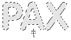
a gradient blend underneath the text with the `1' key depressed
What this does is to draw a blend with only 10% (short-cut keys `1'-`9' set it in 10 % steps, i.e. `7'=70%) and starting below the text quickly fills it with 10% gray.
Note >>> An important feature often overlooked about selections is the fact that their translucency (and other settings in the Paste Controls dialog) will be created on the fly while still floating ! What this means is that if you have a partially translucent figure you can re-position it with that transparency setting still active... Try it , its incredible. We'll use that for our trick here, too.
12. Step 2 involves another very basic fact concerning selections: if you hold the option key and then pick up a selection and drag it away, you will leave a copy of it in the original position! (You simply must get familiar with that. It is so much faster than copy, paste...) (Again, I suggest `Hide Edges..')
Here that is a double whammy: option key depressed we move the selection, leaving behind the 10% blend and at the same time super-imposing a new 10% opaque blend. Instead of dragging it with the mouse I suggest for this trick to use the arrow keys (called `nudging' after an obscure sketch by some British people)
Again: simply press `option' key & left arrow, then lift option and press up arrow, another left another up.
The effect is that you have a 10% light gray and displaced to the left another copy over it and even more toward the upper left a third copy. Every time you press the option key you leave another copy, each one of which will successively darken the previous ones, building up a darker shadow as you nudge it ..very cute.
fig 15) 
The moving self-building translucent shadow...
13. And any time you think you are done with that shadow you can instantly create the actual text. Simply press Option-Delete to fill it black (actually: fill it with the foreground color...) (Note: just Delete will NOT fill it white, but delete the selection itself!) or, more stylish, press the `9' key and do another blend with more opacity across the still selected text in its current position.
fig 16) 
A real blend in the final position...
14. Now for another real important little fact about selections! We'll give it the final polish using this...:
(When the last blend is accepted, make the marching ants visible again). Normally if you move this selection now you will actually move that last blend to some other position.
But you can also move the selection itself ! You need to press the option and command keys first and then move it with a click-drag or the arrow keys. In our case, we want a very small precise movement: just one pixel left and up (or 2 or 3, whatever...season to taste) so: option-command-left arrow-up arrow...
Nothing will happen other than the marching ants being slightly shifted. Doesn't look like much. But the magic is that if you do another blend now it doesn't quite cover the previous one, and Voilà, lovely edge highlights, shadow and light, reflections, refractions, blablabla. The final version of the simple example:
fig 17) 
another last blend top-down with nice edge highlights
Really, if you try this with any text: it involves nothing more than the blend tool 3 times and the arrow keys. It is VERY simple but VERY effective. And it works on any background, too. You can also leave weird motion blur shadows (much faster and more controlled than the Motion Blur filter). Do the last one in color.
15. Ok, after the side step (well actually this really did revolve around selections) lets go back to the puzzle and try another method, totally unrelated, but opening a whole other chapter on selections.
The object was to get all parts of fig 10) into an active selection, remember?
fig 18) 
This was the problem, but of course its only a very simple example
In fact, the concept is very, very basic and you really ought to follow this one closely. It involves really only two steps again. First the creation of a new alpha channel. Go to the Duplicate command:
fig 19) 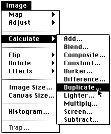
Using Channel Operations `Chops" to set up the selection
Now in the dialog, check the `Invert' box, and set the `Destination' to be the same as the Source file, but in a new channel. The name of your window or file may differ, of course.
fig 20) 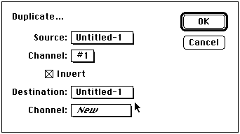
Duplicating an inverted copy of Untitled-1 into a new channel added to Untitled-1.
The window will be re-drawn and you will find yourself in the newly created channel #2. Go to Mode > Channel to see that and then switch back to channel #1 there. As you can see in the hierarchical, you can also just use command-1 to switch.
fig 21) 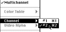
Checking and switching between channels...
You are looking at the same image as before, fig 18), but `behind' it is the other channel. Now go to the Select menu and you will find the `Load Selection' command no longer grayed out. (If you scroll up to fig 11) you will see that back then it was still not available yet.)
Well, just use that Load Selection command now and instantly you get what we were looking for....
16. To recap a little and give more theory. The Load Selection command will look at the next available alpha channel and interpret it as a selection. All solid white pixels are included in the selection, all black pixels are excluded. In our case here is how that looks:
fig 22) 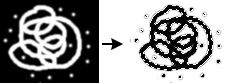
All white pixels in the Alpha channel are interpreted as part of the selection loaded onto the original image.
This is a very cool concept that you have to kind of think about. Let me rephrase it a little. For any image, mono or color, you can create custom selections by adding one more channel and in there hand paint your selection using any tools you like. Whatever is white will become part of the selection. You can of course derive that channel algorithmically, as we have done here. But consider what all can be done to that channel..! You can filter it, spin, emboss, equalize, blur, flip and tumble it... Amazingly general power!
A few points: Use Levels.. and move the white triangle to the left. This will dynamically change in-between gray values to become solid white and will in effect `grow' the selection region. Or use the black triangle to shrink it. Very interesting results can be obtained this way. There is no equivalent way to shrink a selection region by pixels inward (would be nice, though), but this will do it...
17. Lets try a couple neat variations! Here is a single large shape (if you can try this even much larger...)
fig 23) 
a simple grayscale shape...
This time lets just use the Mode > Add New Channel command to get our selection channel. Initially it will be the current background color (normally white).
You will `wake up' in that new channel right away. Simply use the blend tool to create a simple gradient.
fig 24) 
the ubiquitous blend tool
Now you can tell right away that this will become a selection that you could never create with any of the normal tools! The top will be `fully selected' but then it will include less and less towards the bottom. You can bet that this will have amazing repercussions....!
Switch to channel 1 with command `1' or via Mode > Channel > #1 and then Select > Load Selection. There is of course no way for the marching ants to properly indicate what is going on now. It will try the best it can, but usually in these cases you might as well turn it off command -h immediately. In this example it will simply draw a rectangle to the mid gray threshold somewhere in the center..
One of the total basic concepts about selections (so basic that I didn't even mention it. I trust you more than that.) is of course that all tools are restrained within them. If you draw a circle marquee then any airbrush or whatever will work inside that circle but stop right at the edges. Same with any filters or adjustments.
Well, as incredibly obvious as that fact may be, the implication for this situation are indeed profound. In our gradated selection we now have forced all tools and effects to also taper off smoothly without any further efforts. It can seem downright miraculous. Three examples (Undo between each)
Something as basic as a simple Invert will now work with a `modulated percentage intensity'...:
fig 25) 
Just hit command-`i' (Invert) and create the counter gradient in one step!
A simple brush stroke up & down will magically change intensity by position. How else could you do this?
fig 26) 
a solid black brush takes on new qualities
And all the filters will now be modified as well. Here adding plain noise (222 uniform) tapers off magically:
fig 27) 
a new effect: gradation noise...
18. I don't think I need to stress how simplistic this example with a plain up down blend is. You can do all kinds of stuff over in that selection channel and have it modify the tools on the actual image. This opens up a whole extra degree of freedom with all filters, for instance.
The gradated noise combined with gradated Blurring can create very convincing depth perspective, with near field defocussing. Perspective Blur is not a bad little filter to synthesize yourself this way. A radial blend in the selection can also give you a Zoom Blur similar (but actually much more variable..) to the one in the Radial Blur filter, at about 10 times the speed...
fig 28) 
Perspective Noise and Depth Blur
Try also amazing alternate effects with stuff like Polar Coordinates, Offset, Perspective and other less obvious ones. Surprise yourself no end...
19. Ok, another angle on selections, hard as it is to leave that one alone. Lets say you have a shape with marching ants. In this case option `g' of the symbol font...
fig 29) 
some letter or shape....
First while the raw letter is still floating, press command-c to copy the selection to the clipboard...
Then go to the Select menu and peruse the Feather dialog. In this case I entered `9'. The selection marquee will be redrawn and probably resemble some blobby shape. Now, you may have played with feathering before, but let's examine this in the light of some of our new explorations. Go to the Select menu and select Save Selection. This will take the feathered selection and copy it into a new alpha channel. (Presuming you did this with a new single channel file, else if there is already a second or third alpha channel you will have a choice where to send the selection...)
Interestingly, we can now see exactly what a feathered selection is and how it functions.
fig 30) 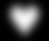
the feathered (9) selection made visible in an alpha channel...
20. If this looks suspiciously like the original heart shape inverted and blurred, its because that's exactly what it is. Furthermore, it happens to be exactly a Gaussian Blur at `9'...!!
This means that if there were no such thing as a feather command we could synthesize it this way! Neat, eh... By inference this also means that you now can easily create a feather beyond the `64' limit and of course more importantly, there are lots and lots of great alternate styles available, such as a motion blur feather or a non-linear feather (by playing with Levels) or a solarized feather (by playing with Curves) etc.
Another special version of feathering would be the asymmetrical one, such a s a vignetting or halo effect. Since we copied the clean shape first, all you need is a command-`v' Paste over channel 2 to create that special outward-only feather . Then go back to channel 1 and Load Selection to continue normally.
fig 31) 
An otherwise unavailable asymmetrical feather!
You could achieve the opposite uni-feather by using Inverse Selection in channel #1, and pasting that over channel #2 (plus an Invert). This is all the feathering action of fig 30) but only active inside the shape.
fig 32) 
The inside-only feather can generate great depth curvature effects
Tip >>> Use `Levels...' right afterwards to adjust the curvature and `depthy-ness' of the feather. Works beautifully.
21. Lets do some Color stuff for a sec.
Note: you cannot work in a two channel mode (grayscale plus selection channel) and then convert to color the way you normally would. You are technically in "multichannel" mode. Therefore convert your grayscale image to RGB first (looks the same unless you are on an 8 bit card and it dithers). Then add your selection channel as #4.
Here we have messed around with the selection channel #4 a little (fig 33). Added some noise, blurred it a bit, used Levels to change the shades. In channel `0' we have the clean heart shape as in fig 29. and now we use Select > Load Selection #4 and use hide edges (because the marching ants are a hopeless mess now).
Using normal Colorization techniques (KPT #12 and 13) will suddenly be modified by that spotted selection and create instant complex textures within the original shape. This can work absolute wonders.
Please have the sense to extrapolate beyond these teeny tiny samples....!
fig 33) 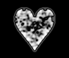
in channel #4 we play with the selection using any and all tools of PS
fig 34) 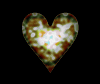
in channel #0 (RGB) colorization is affected by the selection definition of fig 33...
Just for completeness sake a few words about the missing selection related items:
22. Select > Grow does not refer to the spatial grow we emulated above, but rather enlarges the current selection to include all other pixels with related intensities. Again, this is tied to the Magic Wand Tolerance setting (default 32..to grow a selection in finer increments, reduce this number) and it also is symmetrical, i.e. the selection will grow towards lighter OR darker pixels with that specified tolerance.
In my opinion the operation is somewhat haphazard and you would do better to deal with the selection in an alpha channel. Plus you also have the missing `shrink' option that way! (To grow/shrink you simply blur more in the selection channel and then use Levels... to darken or lighten (grow/shrink respectively) the selection.)
23. Border is obvious, gives you a new selection along the edges of the current one, pixel radius user defined. It is interesting to see what that looks like if you use Save Selection and examine it in the new alpha channel. It is not unlike running Find Edges on the (pre-bordered) selection in there, in fact it is almost identical to a border setting of `2'. Now of course you have much broader control to create borders. How about a rippled or wavy border? Do try it.
24. Defringe is a more subtle function and quite powerful at that. It will take the user supplied pixel setting (keep it low, 1,2 maybe 3) and extends from the area inside the selection toward the edges. You can use that for anti-aliasing edges. The manual and Biedny's & Monroys' Photoshop Handbook cover these things anyway.
One note: the Defringe command will be grayed out until there is a `floating' selection. If you want to apply it to a selection, simply hit command c&v to copy and paste back into the same location.
Be sure to also read up on how to add to selections with the shift key, subtract sections via the command key and intersecting with both.
Another mundane item of obvious daily use is the pen tool and its various ways to create a selection with bezier control points. You should be very familiar with anchor points, how to convert a hard to a soft anchor (command control), add or delete parts, convert from path to selection and back, etc. etc. Its all in the manual and in particular take another look at the plastic quick reference card.
Note >>> If you do the path-to-selection conversion a lot, be sure to experiment with the setting for Tracing Tolerance in the File > Preferences dialog!
Other useful items include the Paste Options dialog are commands such as Paste Into. I guess there is room for a second volume on this topic.
happy eclectic selecting... Kai
Tell Compuserve and Adobe if you find these tips addictive or vindictive or vandalous.
By Matthias Müller-Prove. Modified:
5/1/20
