#2 Secrets of Channel Operations: You need more Chops...
All's well that blends well
What?
Because Chops are still the most undervalued tools in Photoshop and `algorithmic painting' is the next wave that just hasn't quite hit yet! But here you are, owner of Photoshop and ready to partake in it right now. Sure this won't replace 3-D Morphing as the best since sliced bread award winner, but in day to day nuts and bolts artwork it is indispensable. Maybe just for me? Well, take it or leave it. I LIVE with the stuff.
In the first part about Channel Operations I introduced the concept of shadow and highlight multipliers and touched briefly on Subtract, Screen and Multiply. I will assume you have read part one first and won't re-explain the wheel...
How?
This time lets start with a little Blend trick...
As always, the effects can be generated at any size, exact numbers are only examples provided for repeatable results. Please no wagering.
1) I will put a shape in here as a sample. It's a Roger Dean "G" from a logo letterform: "Magazine" The bumpiness and raggedy lines are by design. ( Yes, it's another cleaned fax...)
 fig. 1
Now, in the days before the Emboss filter made such things very easy I used the following technique to create those types of reliefs. Interestingly enough, I still come back to it, as it allows other variations than Filter > Emboss (which I use as well, of course) and in this context it sheds light on the nature of "Blend"
Lets have a look at Image > Calculate > Blend...
Interestingly enough, there are a total of nine lines of description in the Adobe Photoshop manual and even in the otherwise very useful Photoshop Handbook there is not a single mention in the entire book or index! I guess it must not be of any obvious use? Let's change that!
Blend will add together the brightness values of each pixel in two images. (similar to Add..) and it allows you to shift the relative dominance of either one, expressed as a percentage. Normally at 50% they are equally "strong". (Again to develop useful tools, I will keep mostly in Grayscale mode, at least for the `operand' file. You can indeed have RGB and CYMK for both images and they may create neat effects with Chops, but for the purpose of creating a serious `vocabulary' of predictable effects I find it useful to separate the color art from the mono masks and channel operators (as seen in the Shadow Multiplier document).
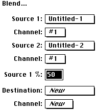
Simple point here: if we duplicate and invert U-1 we will have the `exact opposite' in U-2:
 U-1
U-1  U-2
U-2
Fig. 2a) Normal and 2b) Inverted
Now it is easy to see that combining each corresponding pixel pair will get you the average of the two, which in this case is an even shade of gray... White (256) plus Black (0) gets you Gray (128).
The average is ( A + B ) / 2 in case you had mumps that day.
Note : If the blends and gradients don't look very smooth to you, check if the little Apple icon in the upper left corner has color stripes. It is supposed to be gray! If you have color there, you are still in the 16 shades of gray of the system palette and you are missing 240 additional ones... Go to the `Control Panel' under the Apple menu and in `Monitors' set it to 256 GRAYS! Big difference...

Fig 3)
Here we see further examples. Doesn't make for great romantic novel reading, but to understand, it helps
Upper left : black plus white yields solid grey. 0 and 256 = 128 56 and 200 = 128
Upper right : black &white plus gray yields toned versions of the same b&w. In the Formula example
black (0) and gray (128) gets you lighter black = gray (64)
Lower right : white (256) and gray (128) gets you darker white = gray (192)
Lower left : black & white plus a gradient gets you the same b & w toned up and down by the gradient You can easily look at corresponding pixels and mentally add them together to see how the right resulting image is a true blend of the two...
Well, that's why they call it Blend anyway.
Ok, after some of these `exercises' to get an intuitive feel for the operation, here is the trivial explanation of a very powerful technique for reliefs of all kinds: If the two images being blended (Source 1 and 2) are exact matching duplicates and one is inverted, they `cancel each other' and we get plain grey. But what if they are not exactly registered, but slightly offset from one another? Voila, embossing-city...

Fig. 4)
The middle image is the inverted duplicate and is moved up and left one pixel. After Blend you get the Relief on the right... (that one is damn close to identical to the Embossing filter set at 1 pixel....)
Tip >>> you have several options to offset the second image. The most obvious is Filter > Other > Offset... where you can just type in the pixels (-1, -1) in this case, and use repeat edge for the least nuisance effects. The minus offset is to move it up and left, in order to get a highlight up left. You can of course put it anywhere you like... In this case I simply marqueed tightly around the shape and used the option key (that causes a copy to be moved, which leaves a trail in the edge color behind just moving it would have put a white space there...) Since I wanted to move just a pixel, I used the arrow keys (`nudging'). So "option / left arrow / up arrow" takes about a half a second...
Well let's zoom past the little Emboss filter emulation to other possibilities, because it is a LOT more powerful than that! The plain shape (4a) will be our main image "Source 1" in all these examples.
Let us take the inverted duplicate and use Filter > Blur > Gaussian Blur... set to "4" on it. This gets us figure 5), a blurred shape, which we then offset -4x -3y (left and up). Now let's Blend...!
Fig. 5)  Fig.6)

Aha! Figure 6) now has a light corona effect and a good shadowy curvature on the right. This can be made into very cool effects and images...
Note : As you may know by now, it is the algorithmic nature of these processes that is so powerful and once you have these tool primitives you can combine them to ever more complex pictures. One Blend by itself is nothing exciting...but fig 6) is a good intermediate mask file to have!
Ok, subtle as it is, here is an example how just the offset direction and one inversion can have very interesting results: If we offset Fig. 5 down and right +4x and +3y to undo the previous offset and then Command-F to repeat the offset, and then blend with Fig. 4a and then Invert, here is how that looks
Fig. 7) 
and if we take fig 5) the blurred shape which has been offset, and use Filter > Stylize > Find Edges we get this nice version of a halo edge: Fig 8) (The filters have a whole chapter unto themselves. This is a mere peek...). Now using fig 4a) and fig 8) blended and then inverted results in fig 9). Even more `depthy' than 7). Actually it is starting to look metallic quicksilvery now, which is not a bad thing... (You can go from figure 1) to 9) with a simple 7-step macro automatically....)
Fig. 8)  Fig. 9)

The fun is that you now have all these windows open and can start to mix and match! Blend 7) & 8) and invert, for example, and you get this depthy morsel:
Fig. 10) 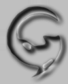
XMore combinations: a copy of the original image (Fig. 1, U1, 4a) offset +4x and +3y, Find Edges, Gaussian Blur... gets you Fig 11), which, blended with 10) gets you 12 and with the original 8) plus invert gets you fig. 13)...
Fig. 11) 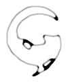 Fig. 12)
  Fig 13)

Not a bad little set of sketches for just a few mouse clicks... and we are still using only Blend, we are still mono, we have no other textures open, etc. etc. etc. And all the pointers from the other documents can be combined as well (e.g. multiply a shadow underneath any of these, or a halo behind it....)
Since we have merely played with the one Channel Operation, "Blend", here, there is obviously another part III coming, just to cover the basics of the other Chops. And quite likely a part IV & V to uncover all the fun tricks that they are capable of in conjunction with each other. This should get some of you started in a few new directions...
PS:
You could add a note if you have results to share with others. Fill out the feedback form in this library. Please let Compuserve and Adobe know if you find these tips useful.
Happy Photoshopping, Kai Krause
By Matthias Müller-Prove. Modified:
5/1/20

