#13 Colorization II: and Hue and Eye...
Why?
Well, I didn't get to finish the job in the first document and I'm not likely to do it with this one, either. There are LOTS of ways to meddle with color. But I scratched the surface pretty well.
What?
Colorization is still the topic, meaning how to go from monochrome "grayscale" images to color. I assume you have read the first chapter of this, KPT#12, if not, do it now. You wouldn't read a murder mystery back to front now, would you. (Chorus of the sickoes "Sure we would...." "I knew it!")
How?
I have started to throw in little bonus techniques on how to create textures `n stuff. Here is a One Minute Quickie (with lots of variations to try):
1. Make the usual window, File > New, 400x by 300y 72 dpi in grayscale
Select Filter > Noise > Add Noise... and use `222', `Uniform' to make it look like that:
fig 1) 
Uniform Noise at 222
2. Now go to Filter > Stylize > Diffuse...and click ok. Repeat that 10 times.( Obviously use command-`f' to repeat.) A more structured stucco-like texture emerges. Use Filter > Blur > Blur More once.
fig 2 a)  fig 2 b)
After 10x Diffuse...and then Blur More
This will be our starting texture, and while it now may look a bit like soft Granite (more so in a larger area than this sample) there are lots of weird alternate styles hiding in there. I am just traversing the idea space in one random way. To do more explorations from this starting image, make a few copies via Image > Calculate > Duplicate now. We'll come back to them. (Is that a macro in your household yet..?)
3. OK, to jump into color a whole other way: Change the image from Mode > Grayscale to Mode > RGB, nothing seemingly happens. Now, if you go back to the Mode menu you find that the bottom options "HSL" and "HSB" are no longer greyed out.
4. Change from Mode > RGB to Mode > HSB now... Again nothing really happens, except the current window is redrawn and the title bar reads "Untitled-1 (Brightness, 1:1)" (by the way if that ever says something other than 1:1 you are zoomed in or out and are not seeing the real thing... Tiplet >>> Double click on the magnifier tool to reset it. ) This indicates that you are seeing one channel, Brightness, which happens to be the original Grayscale image, since that information is interpreted as the brightness during the conversion.
5. We have added two other channels, though. To see one, use Mode > Channel and the hierarchical menu shows Hue, Saturation and Brightness (with their short cuts: command-1, 2 and 3...). Select Saturation....
The window is redrawn, the title says Untitled, Saturation and everything is..... black.
"Nothingness! A void." "What kind of a void?" "An empty void." (Make a note to watch Love & Death)
6. This channel contains the information on color saturation, in other words "How MUCH color is there at any one pixel location". The way it works is that this is a 256 grays (8 bit) channel and White means FULL color saturation, Black means NONE, greys anywhere in-between. In a converted Grayscale image there isn't any color to begin with, so initially the channel is black. But, the beauty is that you have all the tools of Photoshop available to mess around with this channel all by itself and create the color information directly! So, let's do that. Use the Blend tool (Under the magnifier) click at the top area of the window and drag down to the bottom (Tip > Use the shift key to constrain the movement to true vertical). You will get this:
fig 3) 
Creating a gradient in the Saturation channel
7. Switch to Mode > Channel > Hue where we have the same situation. Now a grayscale channel defining WHICH color, pixel by pixel. Understand that these two work together! Defining a color here won't show up until there is a saturation other than black set in the Saturation channel! Since there is no color after the conversion from grayscale, this, too, is initially black. Let's artificially create different hues here.
8. Blend tool, click upper left, drag down to lower right...:
fig 4) 
Creating a gradient in the Hue channel...
Ok to sum this up for a second and as a mental pop-quiz: The brightness channel looks just like the original grayscale image (in our case that granite texture, but you can use anything monochrome).
Think of the Saturation channel as : "where it is black, there won't be any color at all, where it is bright white, the color (defined in the Hue channel) will be at full intensity and greys fall in-between...."
Think of the Hue channel as: "where it is black there will be a certain color in the spectrum (`red', it turns out) (with the intensity defined in the saturation channel), where it is white, it is another color and greys are all the shades in between..."
At white the color is "red" again, it turns out, since the spectrum loops around:
fig 5 a) 
Here is how the grayshades (above) map into the colors (below) in the Hue channel
fig 5 b) 
9. So, looking at the Hue channel we can guess that it will be red at the lower right, cyan in the middle etc. and looking at the Saturation we can assume that there will be no color at the top, getting intense toward bottom.
10. To see the results of the experime
nt, we need to reconvert: Goto Mode > RGB. This will take a few seconds and build the complete 24 bit RGB image from the HSB channel data. Voila, instant colorizing:
fig 6) 
The completed RGB colorized image...
On an 8 bit card, you can also go one more step now from RGB to "Indexed" to see a better approximation.. Still nowhere near as subtle as the real thing. If you do this full screen it is VERY smooth in 24 bits..
Look at fig 6) and read the summary `10.' one more time to see how the channels work together. Once you really `get' this, it becomes a re-usable, predictable tool for you.
That is kind of the crux of all my KPT files, the nirvana state of being able to conjure up any image or effect and know all your tools to such an extent that you can create that image... (and then there are the happy surprises while you're on the way ) (kinda like life. Hm.. Deep.)
Many of you have already dabbled with these things here or there, but to really KNOW what's going on is another matter.
11. ok, hit UNDO...and go back to the multi channel state. Let's see what variety lurks here. ( if you did that Indexed step UNDO will just bring back the RGB...you will need to then go back and separate to HSB again. Caveat: This conversion is not lossless, as you can see in the Hue channel...)
I interject one of the other color dialogs not covered in KPT #12, the Image >Adjust > Curves...
Another very powerful one... For this example, simply click one the two points shown here and the curve will snap around that immediately. You can also drag the points from the initial diagonal if you like...
fig 7) 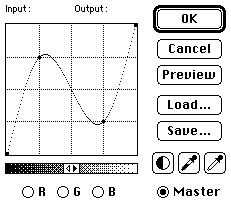
The Curves Dialog and two mouse clicks....
fig 8) 
....get you this color splash! In big, this is REALLY splashy.
This redefines in a very complex way how the colors are spread and you end up with an incredible variety of shades, hues, and neat little details. I hope you did this with the 400x300 size or larger to appreciate the subtlety. Very nice. And if you move the points around or click-drag new ones, or do this in individual channels with different curves....you will see a bewildering array of color, all from that granite noise.
12. I realize you are not necessarily after a mind altering light show (although I extend greetings to a member of Pink Floyd here, who is not necessarily NOT after that..), but this ought to serve as a mere demo of `process prowess'. It is implied that you can pull back to the toned down, gentle, plain or business-like color schemes that fit the job in your particular case. (Whimp)
Many of the filters have unexpectedly effective benefits when used after the splash stuff.
fig 9 a)  fig 9 b)
Filter > Stylize > Solarize and Emboss are very effective with such textures...
Hard to see in the tiny size, but do try them (and others) Solarize will get very subtle paisley effects (Use Adjust Levels and Hue to get it just right) and Emboss (135, 1, 88 is a good setting) will create nice pitted rough stucco wall textures. (Fade out more color and move the spectrum to get neat Santa Fe type backgrounds ) Tip on Emboss, do a Blur before and a Sharpen after...
13. Well, the technique above inserted gradations into the Hue and Saturation channels to synthesize color information. The more refined technique calls for this information to be not random but related directly to the original grayscale image. There are many ways to derive such information and I'll glance over a few here...
14. Lets say we have a grayscale image with some black shape on plain white background. I'll use text here, since that certainly happens a lot, but it could be just about anything.
fig 10) 
Grayscale image ....
15. Use Image > Calculate > Duplicate to create two copies of the original. I will do this with separate windows to explain a further element in the colorizing trick bag, although you could also do it with multiple channels.
OK. The point is you can modify individual windows with any tools you like, but think of them in terms of possible use to define the Hue or Saturation.... and later learn to have such ulterior motives with any image you ever see. Wow. The mind wobbles.
16. In this example, to create a Hue definition we invert the original and gaussian blur it (3 ish) to create more greyshades. Remember to now think of greyshades as different hues. Forget the edges or blurriness they will be defined by the Brigthness channel. That is 11 a)
17. For starters we do the exact same thing to create a saturation channel. In fact you can just duplicate 11 a) to get 11 b). Here it means something different though: the whitest areas in the center of the letter shape will have the most intense color saturation, tapering off to the sides...
18. We take one of the originals and invert it, plus maybe one simple Blur to get 11 c). Interpreted as the Brightness channel it simply means, where there is white we'll see the color...
fig 11 a)  b)
b)  c)
c) 
Hue Saturation Brightness
19. Now for the magic step: Go to Mode > Merge Channels (all the way at the bottom)
You will first encounter a selection of options, namely into which Mode to merge:
fig 12) 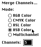
The initial Merge Channels dialog
20. The number in the Channels box will tell you how many windows you currently have open that are mergable (i.e. the same dimensions and grayscale... If the number is less than 3 or not what you expect check that all the windows are indeed grayscale and identical size. Old tip > option-click on the number next to the scroll bar in the bottom left of each window to get the size info)
Simply click on HSB, and the dialog continues:
fig 13) 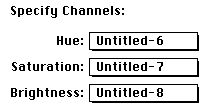
The Merge Channels pop-ups for H S B
21. You will have to remember (or `think ahead of time' or `still see') which window belongs into the HSB slot and use the pop-up to assign them. On a big screen you can drag the windows often so you still see it, but with larger files or a smaller screen you'd do better to think it through before you merge.
What exactly the pop-ups say will vary with how many windows you have open. E.g. it will very likely not be 6, 7 & 8 in your case...
Anyway, as soon as you click ok, the windows will disappear and a new one will pop up in the upper left somewhere. You now have an HSB image and see one channel at a time. You can use Mode > Channel to verify and look at each channel (command 1,2,3 as a short cut).
This is merely a different method to get to this stage. If all three are derivatives of one another you could have used the Grayscale > RGB > HSB sequence just as well, but I wanted you to understand how the Merge Channels command works and what to do with it. In fact, you may get one of the channels from somewhere totally different and then you may need to do it this way...
Tip >>> you can obviously also merge three files into R, G and B and other such variations....
22. Anyway. Now use Mode > RGB and the three channels are interpreted as a single RGB 24 bit color image (again, on 8 bits you have the options to further convert to Indexed to see it better...) and the color is now following the shapes very nicely...!
fig 14) 
The three images in fig 11 merged to HSB and then converted to RGB
23. What you need to understand here is that the color may not be what you want, or the intensity, or the background...but all that is fixable! This was meant only to colorize in a way that the color follows the shape of the original. And as always in KPTs (or nearly) it did it algorithmically at any size or resolution. In other words, I didn't draw the little curves into the colors or used the smears or airbrush to do it. Not that I'm against a painterly approach for those that are good at it or are looking for that effect. But this method is much cleaner, especially across 15 letters in high resolution and also faster in general, accessible by that vast majority that would have to call themselves less than proficient "artistes". Finally there are numerous effects that can not be easily handdrawn at all....
The effects change with scale (especially pixel oriented ones like Find Edges) so don't worry if you don't get exactly this identical look. It doesn't matter.
24.
fig 15 a)  b)
b) c)
c) d)
d)
Hue Saturation Brightness and RGB 24 bit image
Hue : original letter, Blur once, Blend tool with "4" key down, lower right to upper left
Saturation: Blend tool, up, Blur More, Find Edges, Blur and Find Edges Again
Brightness: Inverted copy of Hue, one more blur and sharpen
25.
fig 16 a)  b)
b) c)
c) d)
d)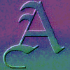
Hue Saturation Brightness and RGB 24 bit image
Hue : Noise 33, Crystallize 3, Blend 50% twice
Saturation: Blur More, Emboss 135,1,100, OverSharpen (SharpenMore 4 times)
Brightness: Blur, Emboss 135,1,100
26.
fig 17 a)  b)
b) c)
c) d)
d)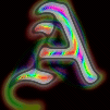
Hue Saturation Brightness and RGB 24 bit image
Hue : Gaussian Blur 3, Twirl 120
Saturation: Blur More twice, Find Edges, Invert
Brightness: Gaussian Blur 3, Arbitrary Map adding various sags and highlights, then smooth.
In fact, that last one about the Brightness channel brings me to the last dialog that adds color controls which we haven't discussed. We talked about Image > Adjust Hue/Saturation, Color Balance (in Colorization A), Levels, Curves... the only one left is the Arbitrary Map.
There is a whole KPT on the Arbitrary Map (#8), but that's focussing on other applications. It also surfaces in the Moire Removal (#10), but yet again for a special case. Here now a few more basic Colorization ideas.
I suggest to load the image "Blendo Spheroids" to do this, as it happens to contain multiple continous tone colors which will demonstrate this effect very nicely. There are two versions in the KPT area, C-cube compressed and a new Quicktime Jpeg version, which is nicer. The examples here show a tiny chunk of that image.
27. What I've outlined so far works fine to go from grayscale to a flat color or range of colors. The following allows you to add interesting spot colors, highlights, reflection effects, neon, metallics, etc. etc.
In fact Blendo Spheroids itself serves as the perfect example: I showed the technique in KPT #5 in grayscale and then used a number of the Colorization methods on each sphere. (After each is created, the selection marquee is still showing `marching ants' and all treatment will affect the local selection only. That's how you get a blue and a red sphere)
With BlendoSpheroids on the screen, go to Image > Map > Arbitrary Map... and in the dialog notice that in the color mode new radio buttons let you switch from Red, Green, Blue and altogether in the Master channel. (These are absent when you enter in grayscale).
Since I can only show the small blue sphere, I'll mess with the blues (don't worry, white boy ain't gonna sing none neither) and select the Blue channel. Now here are some basics you ought to be familiar with (great additions to your arsenal). Do read #8 for more background though.
When you first enter, the ArbMap is a diagonal line as in fig 18 a) in each of the 4 modes R,G,B, Master. You can draw the opposite diagonal (fig 18b) to create the same effect as using Image > Map > Invert.
fig 18)  fig 19)
Normal and Invert
28. Couple more basics: the adjustments are done in realtime with Direct Set Entries and this will affect all color on the screen at once. To see the final colors as they will actually come out, use Preview.
Old tip > On a 24-bit card you need to use option-Preview to get the realtime mode back. Clicking in the title bar (on the word "Arbitrary Map") will momentarily compare to the before settings, Option-Cancel will do a reset in all 4. ("Reset" itself only resets R,G,B or Master.) If you use Load/Save add a prefix or suffix (".arbmap") since there are lots of loadable files in PS. SuperBoomerang is nice for stuff like this, remembering the last chronological list of files and graying out other formats)
Note also that the Smooth button works very well and plays a key role for gradual changes, but the corner points are anchored! This means that all points except the first and last will be interpolated but those 2 stay fixed where you happen to have drawn them! If you modified the last point to be at zero you can push "Smooth" all you want and it will never get back to the normal diagonal.
I will first remove all blue entirely from the image and then look for interesting subsections to add back in. Drawing `near the top' will add blue at full intensity, drawing `near the bottom' will add near black. (Note > this low = black assignment can be reversed by clicking on the little grayramp below the grid. This will mean black is at the top. Other than psychological help, if you prefer to think of it one or the other way, I haven't found any deeper reasons to do this)
29. By drawing a quick line (doesn't matter how wiggly it gets) (my wife's favorite line in this whole file) near the bottom, all shades will be assigned an output value near black.
You can do it all the way down at zero, (the Eskimo's wife's favorite line), but then it looks just like a totally empty dialog. You can use the shift-click method to draw straight vector lines...
fig 19) 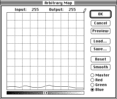
The ArbMap dialog, blue channel selected and blue almost removed from the image
Quick note: I paste b&w dialogs as 1 bit `bitmaps'. They look big but they aren't.
30. Note that the pencil is in the upper right corner. If you click a single pixel at 255, 255 you can then use the Smooth button to go from "all black" to "normal" in about 10 steps. Kind of nice to see it build up almost as an animation.
31. Here is a small part of the original Spheroids file. Read the KPT #3 on the technique. It's fun. Here now you can see exactly how the additional reflections and refractions were added to the initially monochrome image.
fig 20 ) 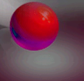
The medium size "Blendo Spheroid".
This started as a grayscale spheroid and was colorized with you-know-what...Proof of the pudding.
32. Now one by one each channel can be modified, as seen in fig 21 a-d). The smooth curves in the Green and Blue channel show up as alternate hues with gradations in fig 22) The little dips in the Red channel are `isolating' certain red bands on the sphere.
fig 21 a) 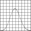 b)
b) 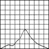 c)
c) 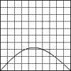 d)
d) 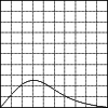
Master Red Green Blue
fig 22) 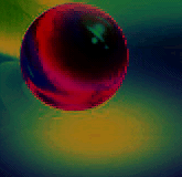
The modified sphere from fig 20)
Note: if you use discontinuous maps (as the red channel above) you are creating artificial aliasing errors and jaggies. They need to be eliminated by other means (e.g. circle selection, then Selection > Border and blur within that, or defringe, or others)
Load the arbmaps provided (includes the one in fig 21) and apply them to the whole Blendo Spheroid image. VERY interesting effects over the entire image, much more than this tiny chunk can show!
To give you some incentive, here are just a couple more examples of what can be coaxed out of the plain clean sphere...: 23 a) is the "Ring of Fire" ArbMap, which emphasizes a narrow blue range to bring out those `continentoids' on the black planet and a lava ring of fire around it... 23 b) is the "Flashed Lines" with an entirely different globe and neat concentric circles in the shadow, as if photo-negative in a flash blast Both of these look positively amazing over the entire Blendo image, as it affects each sphere differently.
The key to the ring of fire effect is to first predefine a smooth bell shape by drawing the crown and the two bottom sides and hit Smooth once. The crown will come way down, since Smooth is a veritable Don Juan in the smoothing department. This gives you the blended Aura. Then draw a new `hard' crown line about 5-10 pixels wide, about 20 pixels above the crown. That extracts the extra bright line. A little tricky but worth mastering...
fig 23 a) 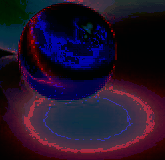 fig 23 b)
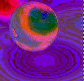
Complex ArbMaps (provided with this Doc file!) applied to a small chunk of "Blendo Spheroids"
I hope you have a lot of fun with these methods and get to employ them some day. And if it's only to walk up to your neighbor Bob's copy of Photoshop and say "betcha didn't know THIS" and show him a thing or two hundred.
Rule # 273 If you win bar bets over $10,000 I get a cut.
Transloading to other BBSs and reprinting is generally fine. If its a commercial mag drop me a line.
Spell my name right. Don't call me before midnight. Send greetings to the Knolls. Plant a tree.
PS. I haven't the foggiest how to get these beautifully printed on a black and white laser.
Please let Compuserve, AOL, and Adobe know if you find these tips fruity, yet not overbearing, with a woodsy aftertaste.
Happy Photoshopping, Kai Krause
By Matthias Müller-Prove. Modified:
5/1/20

