#21 TilinggniliTTilinggniliT: Tiles in Style
Why?
Some of you have resisted getting into tiles. Maybe its the grimy stuff in the grouts in-between or who knows why. You are about to try it and like it.
What?
Tiling has been around as long as planes to infinitely tile, about 13.8 billion years. All it means is a "repeated pattern". Photoshop has a very basic rectangular tile feature, which is well explained in the manual. I will try to point out a few interesting patterns and modifications to try....
How?
Did you hear the one about the Insomniac Agnostic Dyslexic..?
He was up all night wondering whether there really IS a dog....
So much for complete non-sequiturs. Got the humor out of the way. Tile time.
1. Make a tiny window, use even numbers: 30x30, grayscale.
2. Use the gradient blend tool and drag across the whole window diagonally.
Fig 1) 
the tiny pattern for tiling...
3. Use `command-a' for Select All, then go to Edit > Define Pattern.
Note: with a rectangular selection, Define Pattern is grayed out
4. Make a second window. Large, say 400x300 or larger.
5. Command-a again and now go to Edit > Fill...
fig 2) 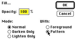
The Fill Dialog... click on "Pattern" to create a tiling
6. Say Ok and there you are. The large window is tiled full of the little tiny pattern. This is all old hat and you knew all this anyway.
fig 3) 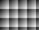
basic tiling in action
I, for one, have a QK macro to go into Edit > Fill and use pattern at 100% to tile. Its a little faster if you do it repeatedly...
7. You might play around a little with different parts of the gradient to vary the tiling. The upper 12x12 pixels in the tiny window get a nice dark background for light titles or text. And so on...
fig 4 a)  fig 4 b)
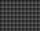
A different section of the tile yields a whole new image
Tip>>> If you want to save the tile for future use, you should realize that the marquee will vanish immediately after you select Edit > Define Pattern and the region is deselected. It is therefore advisable to command-c "Copy" it first (command-n, return, command-v will put it quickly in its own window). No biggie, but it helps.
8. Another variation: go to the tiny window and double click on the gradient blend tool. Select `Radial' instead of linear and make a little circular blend. Use command-i to invert the image (unless you switched fore- and background colors). We have done these things before, I assume you can follow...
fig 5 a)  fig 5 b)

A little Sphere tiled into a larger window...
9. The new wrinkle now: select the small tile window and then go to Filter > Other > Offset...
fig 6) 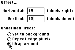
move the image in the window exactly half way, with the Wrap option on
You have to set the Offset to exactly half the size of the window (which is why I asked you to use even numbers in step 1.) The Wrap option is self explanatory and we use it nicely here.
fig 7) 
The sphere wrapped halfway
10. Now Edit > Define Pattern with the new shifted image...
11. Select the large Window and go to the Edit > Fill... dialog. Set it to 100%, but Lighten Only !
fig 8) 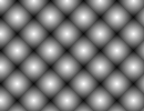
Yeah! Two layers of tiling are merging via Lighten Only...!
The second shifted sphere tile is White exactly where the first one was black... so they join up symmetrically and create a new double tile. Cool, eh? You better believe this has other uses. Try even just the old Levels.. to create wider gaps and other cute variations.
Tip >>> If you don't remember the size of a window but want to Offset it halfway, simply option-click on the size number in the lower left corner, next to the scroll bar.
12. To change to another method, select the tile window and select just a smaller portion now. I used a 12 x 12 area near the bottom right. Edit > Define Pattern.
Tip >>> After you start dragging press the shift key to force the marquee to be exactly square. Makes for better tiles to have them square, unless you want them at another ratio for effect.
13. Select the large window. Edit > Fill... this time select Normal mode, Pattern and 33% opacity!
This will overlay a totally different pattern and blend it at a transparency level.
fig 9a)  fig 9 b)
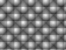
Another way to do multi-layer tiling...
This is now actually a triple layer tiling effect, although not a very imaginative one... Each can also be done in a different color.
Try also to set the offset at a smaller number, say 5,5 and then you have 6 steps to shift back to the origin. Each can be tiled over the previous ones at a say 20% opacity...
As usual, I just want to get you started. There is lots of virgin snow to explore!
Now for a more business-like task involving tiles: A background of a logo, embossed ,at an angle, tiled
14. Make a window of say 300x200, exact dimensions not important. (For serious final quality that might get much higher, although the tiling source one is not the weakest link in that chain)
15. Type in whatever title, business name, logo or whatever suits your needs.
Here is the example:
fig 10) 
Select the Marquee area with Tiling in mind...
Note that the space on the right and bottom will determine how fast the logo will repeat vertically and horizontally... then Edit > Define Pattern...
16. Make the large window in the size you need for your project. If it is just for screen presentation, that maybe 640x480 or 104x768 or 1180x870, but it could also be 3000x2000 if you are doing big time stuff... There are more steps involved. Stay in small manageable sizes until edge sharpness and ultra smooth blends are really required. Here I intend to go through an Emboss and Rotate still, so it might as well start fairly low res... but it highly depends on your project and your set-up, too....
Here is what I got...:
fig 11) 
plain tiling, first pass...a 640x480 window shown reduced
The simple tiling yielded several problems. The logo is cut off on the right and bottom...
17. To fix that we can simply go to the Tile window and marquee I slightly smaller area...define and fill the large window again to see how it works. A couple of tries and you should get it...You could compute it, but what the hell....trial and error is such fun.
Now we WILL compute something though: I much prefer a staggered tiling and the way to get it is to select the second row and use Filter > Other > Offset with Wrap, horizontally only. But you must know what number to plug in there.
18. Turn on the Window > Show Info windoid (I routinely move it underneath the tool palette on the left since that vertical area is already shot, so to speak...). What we need to measure now is the number of pixels from peak to peak of the tiling. Its Frequency...
Note : the units shown in the Info windoid can be set in the File > Preferences > Units dialog and they must be "pixels" for this to work...
fig 12) 
Dragging across with the marquee you can read the distance between any repeating feature
19. Here it is 214 pixels. Select the entire second row, go to Filter > Other > Offset and enter exactly half that number (107) for horizontal, `0' for vertical, wrap option on. Of course you might just drag a part of the second row and get it so so, but this is actually so damn fast and guaranteed to work on the first try, that I bet it's quicker almost every time. Save your trial and error fun for another day.
fig 13 a)  fig 13 b)
Shift rotating the second row for a non rectangular tiling effect!
20. Now in order to tile the whole window in staggered rows, you could of course select the entire width and include just the first two rows, Define, etc...., but there is a little known feature in Photoshop that makes this `in general' even easier...! Any Tiler or Tilee should be aware of this one:
fig 14) 
Special Photoshop magic: it auto computes the repeat frequencies in any repeating pattern!
What it means is simply: select an area definitely larger than the repeat frequency and define it as the pattern. Photoshop will reduce the redundant parts all by itself and create a smooth tile. ! Wow!
Note : this will ONLY work if the repeat pattern is bit by bit the same. If you had run an emboss or a blur over this it may be just ever so slightly varying and the auto-tile won't fly. It will then take the literal marquee size...
21. Now we have the staggered effect as desired... I would probably continue with a Duplicate of this image, since the plain one may come in handy for Chops stuff later... :)
fig 15) 
A non rectangular tile pattern....!
22. Now for a quick treatment: Blur More, command-f (repeat filter) twice..., the Filter > Stylize > Emboss. Set to 135 degrees (clean angle) and height `1'. Should look like this:
Fig 16) 
Embossed logo (only one shown at actual size)
23 Since I want to overlay other text over this background, I prefer to tone it down first. Note that the slightly blurred look is intentional. you could Sharpen or Unsharp mask it afterwards, or not blur as much before hand. I do recommend at least a 1.2 Gaussian before any Emboss though, or you'll never get rid of the ensuing jaggies... I also greatly prefer a low Height setting of `1'...
fig 17) 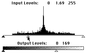
Toning it down in Levels... : Move the middle gray and the bottom white controls...
Tip >>> Emboss and a few other functions can generate a 128 Gray shade on which the cursor will not be visible! If you need to work a lot with the image and that might be distracting, simply go to Levels.. and move the gray triangle left or right a few pixels... visibility-city!
fig 18) 
Rotate the image for the final effect...
24. Simple old method: use the Cropping tool (under the lasso) drag a rectangle, then press the option key and go to the lower left handle and drag it up and right. Should look like fig 18) (ants are a little hard to see..). Then enter the rotated rectangle and with the scissors cursor click once: when you let go the rotated center will become your new cropped normal window.
fig 19) 
Final effect of a tiled background. You might use it some time...
Lots and lots of variations, obviously. You could have them much smaller, un-embossed and with all kinds of other different choices at any one point in the path. For the killer power guy this may have been light lunch, but I also like to help the mid section of the demographics to escalate ever upwards into the ivory tower snobby section. And then have them clean up there. You know who you are...:)
fig 20) 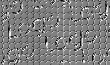
Puzzle: Find Edges, Emboss and a secondary pattern overlaid.
Read the manual on how to use Offset to put the side seams of a tile in the center and then lose them with clone or blur tools in order to make infinitely repeatable tiles without edges. It is basic knowledge and I rarely explain things here that are in the manual or book anyway.
Keep playing with the ideas. Send me a note when you find something, better yet, post it! I do see almost everything that gets uploaded, sorry if I can't contact each and every one of you for those, but believe me, I love to see them.
greetings ..Kai
As usual, send waves out to other people. Encourage them to come on-line, encourage yourself to post tiplets and pix and moronic questions, which everyone wanted to ask but thought they wouldn't come across THAT dumb and now they are eternally greatful that YOU asked it and you will get love letters for weeks and finally marry one of them: a cute blonde from Vienna and have 4 children, all of whom become hackers at age 9 and make you rich with some weird A.I. app they bring out, until one day you decide to try a Unix machine and a beard will grow, which she is allergic to and you move to New Guinea. No more Mac. No more tips from you.
Come to think of it, don't post anything, it's clearly way too dangerous.
No, I really am better. I think.
By Matthias Müller-Prove. Modified:
5/1/20

