#7 Filter Skelter: Displace is nice....
Why?
Because this thing is very powerful and complementary to all the other Distort filters. Also, it is the least obvious and has very little documentation. There is a file up here which also appears in David Biedny's PS Handbook and that does explain the basic ideas. I hope that the examples in this document show a wider range of the possibilities and entice you to modify and create your own...
This was at first one very large file discussing all aspects of Displace at once with examples from each of the six displacement maps. Unfortunately it was 500K after Stuffing. So I decided to split it into 6 separate archives with a small doc file plus the actual filter stuffed together [#7 #7a #7b #7c #7d #7e]. That way you can load them at will as you get into it. Chances are once you play with one you will want the others (less than a buck a piece) but its up to you. I was afraid one large monster would keep too many away from something quite interesting.
How?
To use the filter maps is quite trivial. To make your own is a little more involved, but not too hard either.
For the basics, the description in the manual (p177) is straightforward enough.
To really judge the effect of various filter settings, I made myself a "standard test grid' file. A small monochrome version of it is available here. It consists of a grid, concentric circles and a contone face of an elderly gentleman. (note: the face does not have to be that of a Nobel prize winner, but it helps) (I know the poor guy has been terribly over- and mis-used, but I was born on the same day, March 14, and have felt a close affinity with him for many, many years, so I delude myself to get away with it...) (Anybody foolish enough to read all his original texts in German would probably get his OK anyway, I'm sure....)
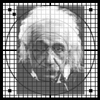
fig 1) Standard test grid
This standard test allows you to judge spatial changes in many different ways. Note that merely a grid is not enough, as you will see in the examples below. There are ways to spatially warp the image which afterwards you can readily identify by the face, but which would look like just so many grid lines without it.... Conversely, small aberrations, blurs, etc. can be easily detected in the grid and circles. I do believe that the sample image in the Adobe manual does not work too well illustrating the effects of many filters.
I will cover unusual applications of other filters, as well as interesting settings in a future document. Believe me, there are numerous effects not generally known to casual users and some that might intrigue even the most jaded power PSer.
I guess it doesn't hurt to restate the obvious for a second: Displace is a special form of distortion which affects each pixel of an image by a shift in position. The pixel can be made to move horizontally or vertically, plus or minus, and the instruction for this comes from a second image file, referred to as the "Displacement Map" (`Dmap') . For ease of illustration assume that both files are 200x200 pixels (as is the case with the test grid and the displacement maps I provide here) so each pixel in the image has a corresponding pixel in the Dmap. The gray value of each pixel in the Dmap can vary from 0 to 255, black to white in 8 bits. The rule is very simple: Black 0 will cause maximum positive displacement, White 255 will cause maximum negative displacement and the middle gray, 128, will be considered neutral, no displacement. That's the crux of it.

Fig 2a) Horizontal X DMap
The black pixels on the left mean "displace maximum positive X",
The white pixels on the right mean "displace maximum negative X",
The neutral gray in the center means "Don't displace at all".

Fig 2b) Vertical Y DMap
The black pixels on the top mean "displace maximum positive Y",
The white pixels on the bottom mean "displace maximum negative Y",
The neutral gray in the center means "Don't displace at all".
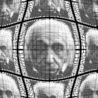
Fig. 2c) The 2 channel DMap applied to the Standard Test Grid:
A spherize effect in the center, multiple copies through the "Wrap" option
Some notes:
a) All are multiplied by a Scale value entered in the dialog. Special case: If the Scale is set to 100 then the displacement is exactly the gray value in pixels: e.g. Gray at 148 is a "plus 20 pixels" from 128...
IMPORTANT NOTE >>> Not documented is the fact that there is a switch from how one would intuitively expect this to work. Normally "Plus X" is to the right, "Minus X" to the left, right? (Who's on first) and normally "Plus Y" is up and "Minus Y" is down, right? Not! This is because the X-Y Cartesian coordinate system we all know and love dearly places the origin (say in a bar chart) in the lower left corner. In Photoshop the origin 0,0 is instead in the upper left corner, a convention that according to some stems from cursor positions in text starting at that location, which also led to math routines and display memories being laid out that way. Either way is probably equally `correct' (I've had that discussion), but one must be aware of it. In this case "Maximum Positive Y" is going DOWN not up...
b) Note that the new position of each pixel really has two components, X and Y. The Dmap should have two channels, #1 will be interpreted as the horizontal X Dmap and channel #2 will be the vertical Y Dmap. Additional channels are ignored.
c) If the DMap only is a single channel image, then each pixel will be applied for both X and Y equally. This will create mostly diagonal movements. All examples here are two channel Dmaps, often with careful four quadrant matching to design specific effects.
While there were a number of examples shipped with PS 2.0 most of them were meant to be used in the "tiled" mode. While that can create nice tiling effects, it ignores the entire other mode of operation for Displace: In "Stretch to fit" it is the entire image that will create the effect.
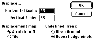
Fig 3) The Displace... dialog.
There are 6 Displacement maps available initially. You can load them as normal picture files and see the inner workings as shown here (only in quarter size... )
Each is a three channel file and therefore in native PS format. Channel 1 is the horizontal "X" displacement, Channel 2 the vertical "Y" displacement and Channel 3 shows the effect applied to the standard test grid, in case they are separated from the doc file.
Tip >>> such multichannel files have to be, by definition, in native Photoshop format. Be sure NOT to use JPEG compression, as it is not lossless and will scramble the channel information! I.e. A 6 channel file jpegged will not be a 6 channel file afterwards. It is likely to not even load at all, let alone in six channels...(Use Spit Channels, Jpeg individually, later Merge Channels again)
All channels beyond #2 are ignored in the filter operation. You can delete the example picture in Channel #3 if you feel desperate.
Note > It is important to understand that the filter works in actual pixel offsets. This means that the effect can vary greatly depending on the size of the initial image! The maps are 200x200x8, as is the sample grid. If the image to be filtered is 800x800 the filter will create offsets the are extending only a quarter as far! You can use the Scale field in the Displace dialog to compensate for this. In most examples, the scale was set to 33 for both x and y. To refresh your mind: 100 equals the `normal' offset of 128 pixels. You can `overdrive' that up to 999, though... In other words, if the effect you see here at 200x200 should be applied to a 800x800 file you would have to have to use 4x the Scale number to achieve that (eg.133/133 instead of 33/33, or more... season to taste)
Here is a real life example, and the actual filter is part of this archive file, so you can apply it to any image.
"Moebius Warp":
fig 4a) 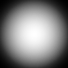 fig 4b)
 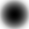 fig 4c)
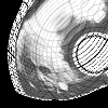
This one will displace an image with curvature...Notice how it actually wraps 360 degrees and creates a complete circle out of the side edges! This is also a good example of the value of the standard test grid. You can readily see that the center portion is spatially warped, but relatively intact.
fig 3d) 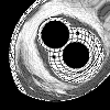
Increasing the Scale to 66 / 66 will actually complete the spatial twist full circle: The black areas stem from the "Repeat Edge Pixel" option and would fill up with duplicate images if "Wrap" had been used instead.
fig 3e) 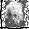
A small setting such as 9 / 9 will create more subtle curvatures and can make nice flags and such.
Big Hint >>> Animation...! As you can see, the scale parameter can vary. 0/0 has no effect, 6/6 a slight wave all the way to anamorphic moebius wrapping. A NATURAL for unbelievable animation effects...simply crank the warpness from frame to frame and out-do the ADOs at their own game. The hardware is coming down to do this. Get ready!
Read the Adobe manual and the Photoshop handbook by David Biedny and Bert Monroy. These tips are often complimentary to basic techniques described there.
PS:
You could add a note here if you have results to share with others. Fill out the feedback form in this library. Please let Compuserve and Adobe know if you find these tips useful. Please participate...
Happy Photoshopping, Kai Krause
By Matthias Müller-Prove. Modified:
5/1/20

