#19 Another Chopping Spree, Vol.3c
Close to the Edge, n' stuff...
Why?
There is so much more to do with channels and compositing, it isn't even funny! As most of you know by now, I am in the process of doing this whole tips thing on a CD ROM with LOTS of images and LARGE ones at that. You will see there among literally hundreds of `final art examples' just what bewildering variety of wilderbeests can be created with the old Chops... and when I scroll through them by the dozens I am recalling nearly 5 years worth of channeling, tunneling and meddling. Well, as some of you have found out by looking at the more complicated examples, I haven't spilled every secret yet. But I'm willing to part with a bunch more...
Whenceforth?
Lets do some more stuff with masks. The last time I used a plain black mask and shrunk it slightly to steal only the clean insides of an area and that's certainly a staple technique that can yield extremely clean edges. But there are a number of extensions to the theme. I will not build a whole texture thing from scratch here this time and concentrate on a variety of examples without necessarily making you follow them step by step. We'll cover Difference and cleaning thin lines and other goodies as we go.
1. A typical technique that people use because it seems obvious is to use Select > Border to create an outline border region which they then blur and such.... This can have problems associated with it! And they can be avoided with a bit of masking Chops!
Example: If you do a border around an area, here at 8 pixels, try to use a 50% blend across it, or simply an Image > Map > "Invert" and notice the little jaggie artifacts that happen:
fig 1 a) 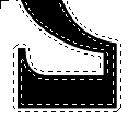 fig 1 b)

Using Select > Border may not work as you expect it to
This is because Border specifies an implicit feathering at the same time! So what looks like a normal region of say Border 6 is at the same time extending 6 pixels feathered in and out....
2. Note > You might actually remember this artifact and exploit it for some pretty cool `crystalline growth" type effects... It happens when a feathered selection meets with a constant operation at some angle. Just feather a circle at 64 and try various blend/invert operations, then Levels/ArbMap/Curves to bring out the details.
fig 2) 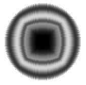
Exploit the artifacts! Live with your troubles! That missing leg could be a boon!
3. So here is what we obviously were REALLY after and got 1b) instead....:
fig 3) 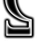
The real MacKai version of 1b), this time done with Chops.
4. Here is how to do it. Make a duplicate of the black mask (1 a) and blur it once, just a little. Then run Find Edges over it and invert. (In Photoshop 2.5 don't invert). With a black shape one white background this amounts to an edge extraction. Looks like this:
fig 4 a)  fig 4 b)

Find Edges gets a clean outline, which can be further transformed and blurred...
4 a) could be used as is for a hard edge effect. In order to get fig 3) we simply G. blurred 4a) some more. Now for the Chops part:
It concerns one channel operation we have used without much explanation a few times: Difference.
5. If you take two full color images (of the same size) and run Image > Calculate > Difference you will get nothing more than one hell of a colorful mess. In such a random way many people have toyed with the chops functions and dismissed them as less than brilliant for `real' work.
Au contraire, Claire, as we probably proved many times over around here. The way I like to think of Difference is to use `any image at all' in one source and the second one is a "selective inverter". Just like Image > Map > Invert inverts the whole window or selection, you can invert just like that with "Difference". The rule: "whatever is solid black in the difference channel will be inverted, whatever is white will be left alone, whatever is gray in between will be inverted proportionally..."
Just look:
fig 5a) 
Source 1: Any Image...
fig 5b) 
Source 2: a grayscale image designed specifically to invert with its black areas
fig 5c 
The Difference between them, PLUS an Invert operation
Fig 5c) is exactly the same as 5 a) except that all areas black in 5 b) are inverted.
For the techno dweebs with hacker backgrounds & pencil holder dreams, this is kind of a XOR bit blit, except it works in 8 bit continuous grayscale. It can yield GREAT effects. The point is, you can `think' about the Difference channel as an invert-by-choice tool. This what we did above for fig 3). Simply use 4 b) as the invert channel in Difference (Source 1 and 2 are exchangeable in Difference) and 1 a) in the other, out pops the desired fig 3)....
6. The edge stuff as a mask (or as a Chops ingredient like we did just now) is quite useful, so I should add a few items on how to improve the looks of that.
fig 6 ) 
how to get an `edge only' Chops tool....
In previous Chop procedures we kept around duplicates that were blurred and displaced and subtracted and blended and clean sharp ones, shrunk, etc. Well, add "outline" ones to that, because they add very cool effects or can cleanly lift off a shape from a texture, etc.etc.
To get 6 ) we simply took a solid black 5 a) and ran Find Edges over it. (Often a little Blur More before will smooth things further.) Now to get much larger and more blobby is obvious. But how to thin and smooth those lines is NOT..!
7. The technique we used to clean shapes many times now, G.Blur and Levels... as outlined first in "how to clean up a fax or scan" and re-iterated in the last couple Chops docs works really extremely well on black solid areas. you may have tried it on thin lines before and ran into the following scenario:
fig 7 a) 
A thin line in bad need of some cleaning
You have a line, be it from that famous fax or scan or you somehow drew that yourself. Now you apply CleanUp 101 only to get a peculiar mixture:
fig 7 b) 
The middle looks as needed, but there are clumps and drop outs! What to do....?
The trouble is that the technique relies generating transitional shades from black to white which later in Levels get converted to smooth edges. With thin lines though close neighbors will blob theirs together and others will thin out prematurely. Luckily there is a little known filter ready to be applied here: The white choke Filters > Other > Maximum set to 1 pixel ! Try it... its a minor miracle for these situations!
fig 7 c) 
MUCH cleaner process with the Maximum Filter....
It is unfortunate that Maximum works in integer pixels only, but you can tune the results both by a slight pre-blurring and a post levels treatment. Thin lines should be forever clean for you....
Note: Incidentally, the Minimum filter chokes white from surrounding black....
8. If you have a nice edge available such as fig 6 and you do a Difference with the solid shape 5 a)
fig 8 a) 
A Chop Difference involving the edge outline creates more complexity : cleanly...
To get more complex and subtle artwork here is a quick example on how to apply it all together. It's a little advanced and assumes you read and know all the previous Chops docs...
Add a gradient to the artillery: simple blend tool coolness.
fig 8 b) 
a plain gradient blend
Then we use the solid shape as a mask for a composite with the gradient, and after that the outline edge as a mask for the Inverted gradient. Looks like this:
fig 8 c) 
The gradient shining through inside and in the edges, in opposite directions
fig 8 d) 
Works in color, of course...
...but for color work remember to keep one Difference channel in grayscale to get predictable results.
In fact I suggest to separate the shape work from the hues and color stuff. Operate on your shape and composition in grayscale (3 times faster, too) then add colors and textures later. There certainly are enough ways to get color.... :)
9. I just saw some people struggle the hard way with this so here is a little tip: If in an image such as 8d) you wanted to invert the image, i.e. on a white background, yet keep the colors the same, simply realize that there are two Invert options that can be separated: Image > Map > Invert will give RGB opposites for every pixel, thereby inverting all colors as well.
fig 9 a) 
Inverted all the way...
But there is one that deals with JUST the color and will leave all monochrome shades alone! It is the Hue control and that can shift the colors right back where you had them before....:
fig 9 b)  fig 9 c)
simply go to Image > Adjust Hues... and "Wrap the color wheel 180 degrees"
So remember : After "Invert " you can get the color back with Hue 180 degrees" (left or right, those ends meet..) A hell of a lot easier than to pick up the black background and try to fill it somehow...
And now with the new CHops Difference technique you know how to pick up any inside area and selectively invert just that.
There are still umpteen tricks in the bag. Don't be sad. Isn't it a better feeling that there ARE still some things left to be found rather than standing at the brick wall dead end? I am happy every time I run across yet another little unknown phenomenon. Some include my wife even....
And so we shall go on.
have fun, Kai
Tell Adobe and AOL and InterNet and CompuServe and SuperMac and BMUG and BCS and MacWorld and MacWeek and MacUser and your neighbors granddaughters gym teacher's niece-in-laws pool man that you read one more of them things.
The CD Rom is doing very well. I am basically dead on track, trying for a test pressing in July and shipping in August. The filters alone will boggle your mind, I promise.
By Matthias Müller-Prove. Modified:
5/1/20

